-----------------------------------------------------------------------------------------------------------------------

 Among the many aspects of miniature effects work delved into was the particularly interesting 'big budget versus small budget' section where to my surprise, most of the participants revealed a far greater love for the modest and low budget jobs over the mega million contracts. Really fascinating. Sadly, several of those interviewed are counting down the days when miniaturists such as themselves will no longer be required and it'll all go the way of traditional matte painting...down the gurgler and into a godammed computer program! Can it possibly get any worse than that???
For more information on this extraordinary DVD, click here.
------------------------------------------------------------------------------------------------------------------------
 |
| I miss the days of great showmanship and bold ad art such as this which would guarantee a movie house full of screaming kids at the Saturday Matinee double bill. Who could resist a glorious, danger filled poster such as this? When was the last time any of you recalled a good movie one sheet at a (dare I say it) 'Multi-Plex'? |
 |
| Matte painter P.S (Harrison) Ellenshaw |
Welcome to the second part of my Disney
Epics blog, with a close look at the many special matte and miniature trick
shots in the 1974 show ISLAND AT THE TOP OF THE WORLD. Once again I’m very much indebted to former Disney matte
painter and later head of the matte department Harrison Ellenshaw - a gentleman and a good sport - for his
considerable and generous input as well
as numerous fascinating recollections of his own experiences while assisting
Alan Maley with the many, many matte painted shots which would form the
backbone of the film.
 |
| The immortal line "France will rule the air" (!) provided nice subtext to this multi part matte shot (to be explained later...) |
 Our scenario, set in 1907 – a good period
for high adventure - revolves around a somewhat mismatched group (aren’t they
always?) of intrepid explorers – the requisite dashing American archaeologist
(the hopelessly wooden and monotone David Hartman who in every scene suggests
he’s narrating a Disney trailer), a wealthy Englishman (a very irritating
Donald Sinden), an eccentric French inventor (quintessential French character
actor Jacques Marin) and an Eskimo (Mako, taking a break from Korean POW’s on
MASH) on a trek to the North Pole, or thereabouts, in a frantic search for
Sinden’s long lost son. Their quest
brings them to a lost Shangri-La world of Vikings, volcanoes and the storied
Whales’ Graveyard. All good stuff in a
very Jules Verne-esque tailored adventure. The basic plot here has plenty of
potential, and I can’t help but feel much more could have come of it in better
directorial hands. My conversations with
Harrison Ellenshaw have been entertaining to say the least. Seems Harrison isn’t anywhere near as
forgiving as I am and found a re-screening of the DVD to be a tedious and
pedestrian affair with about a hundred too many reaction shots, endless
exposition and Donald Sinden, who chews the scenery like a Harryhausen
Rhedosaurus, though without the Beastly charm.
Our scenario, set in 1907 – a good period
for high adventure - revolves around a somewhat mismatched group (aren’t they
always?) of intrepid explorers – the requisite dashing American archaeologist
(the hopelessly wooden and monotone David Hartman who in every scene suggests
he’s narrating a Disney trailer), a wealthy Englishman (a very irritating
Donald Sinden), an eccentric French inventor (quintessential French character
actor Jacques Marin) and an Eskimo (Mako, taking a break from Korean POW’s on
MASH) on a trek to the North Pole, or thereabouts, in a frantic search for
Sinden’s long lost son. Their quest
brings them to a lost Shangri-La world of Vikings, volcanoes and the storied
Whales’ Graveyard. All good stuff in a
very Jules Verne-esque tailored adventure. The basic plot here has plenty of
potential, and I can’t help but feel much more could have come of it in better
directorial hands. My conversations with
Harrison Ellenshaw have been entertaining to say the least. Seems Harrison isn’t anywhere near as
forgiving as I am and found a re-screening of the DVD to be a tedious and
pedestrian affair with about a hundred too many reaction shots, endless
exposition and Donald Sinden, who chews the scenery like a Harryhausen
Rhedosaurus, though without the Beastly charm. |
| Mini masterpieces in their own right, above is one of the scores of evocative concept paintings by Production Designer and Photographic Effects Director Peter Ellenshaw. If anyone could sell a concept with a few flourishes of his paintbrush it was Peter without question. |

The film, while by no means one of Disney’s
most memorable efforts, is an entertaining and action packed yarn very much of
a style no longer seen nowadays. If
there were one major failing it would have to be the dull in house ‘direction
by the numbers’ so often employed from within the inner workings of The Mouse
Factory, with the bar rarely being set above TV Movie of the Week in terms of
character development, dialogue, lighting, pacing and overall creative film
making. Let’s face it, Disney heads were
adamant that all of their cinematic product looked, sounded and tasted exactly
the same – no seasoning please - though I’m the first to admit I still enjoy
many of their shows as much now as I did when seeing them on first release. More often than not the impression a film
left upon me in my younger days at the Saturday Matinee double feature still
retains that much loved flavour 40 to 50
years later, more so in fact than the average dross that passes as ‘cinema’
these days.
 |
| More magnificent pre-production art by Peter Ellenshaw. |
The vast scale of the production was a
mammoth production design project, with Disney Studios’ pre-eminent
collaborator and visual stylist Peter Ellenshaw engaged to oversee not only the
entire special effects shoot but the overall production design as well. I’m convinced that all that is great about
this film is a direct result of Peter’s hands on involvement and creative
foresight in the film’s look. An
astounding number of beautiful and evocative acrylic conceptual paintings were
prepared by Ellenshaw, and thanks to Peter’s son Harrison, I’m delighted to
include many of those here in this article.
 |
| Peter Ellenshaw (centre) with Al Roelofs and Art Director John Mansbridge on Disney's Burbank backlot set holding his sketch for the central set piece of the film which will constitute a number of key painted mattes. |
Despite the aforementioned quibbles, ISLAND
remains a treat for traditional era matte art enthusiasts with an astonish
quota of matte shots filling out the narrative, with many set pieces consisting
of wall to wall painted mattes, some of which are extremely successful – and
I’m thinking of the wonderful glacier and crater painted shots in addition to
the Shangri-La Viking city shots being quite glorious renderings in their own right.
 |
| An utterly glorious Ellenshaw concept painting for a view not used in the final film. |
 |
| Supervising matte artist Alan Maley. |
The majority of the mattes were painted by
then head of department Alan Maley with long time assistant painter Constantine
‘Deno’ Ganakes and apprentice matte artist P.S (Harrison) Ellenshaw providing
sturdy support with the substantial ‘block in’ preparatory work of the several
dozen paintings which would form the basis of close to 93 finished ‘cuts’ with
matte art. One or two mattes for the
climactic Whales Graveyard sequence were painted by veteran MGM artist Matthew
Yuricich on a brief stopover at Disney.
Photographic Effects supervisor and the film’s Production Designer Peter
Ellenshaw would himself provide more than a dozen painted mattes for the
volcanic sulphur field trek in the final weeks of post-production to help meet
deadlines. It was by all accounts a very
busy matte department.
 |
| A quick Ellenshaw sketch rescued later from a garage sale! |
As a comparison I feel that the earlier IN
SEARCH OF THE CASTAWAYS to be a considerably better film, with smoother,
frequently arresting photographic
effects shots – a great many which still look like a million dollars over fifty
years down the track. ISLAND probably
has a greater number of trick shots and would be the all time record setter for
the studio though some of the painted mattes look extremely rushed and several
painting composites tend to be like a poke in the eye with a sharp stick with
very poor washed out RP plates ill matched against the painted element. Of course, not all is lost with alot of great mattes and even several
surprisingly invisible matte combinations that slip by all but unnoticed, as we
shall see in the large photo spread later in this article.
 |
| Miniatures Supervisor Terry Saunders and Hyperion model. |
While matte art was of major urgency the
Mechanical Effects Department at Disney, under long time head Danny Lee, was
engaged in building and controlling a large miniature of the main ‘star’ of the
picture, The Hyperion airship. The design
is somewhat wacky and unappealing and I find that the earlier, rejected
concepts of the airship to be more of my liking and quite elegant. Miniaturist Terry Saunders and his team built
the airship with veteran Effects Cinematographer Art Cruickshank as D.P on all
of the quite variable miniature shots.
Cruickshank had been with the Disney Studio since the 1940’s and had
been buried away in the Process Department under Ub Iwerks, working on opticals
for films such as FANTASIA. A brief
departure in the mid 1960’s saw Art move over to 20th Century Fox to
work as Bill Abbott’s right hand man on many films and television shows, with
Art collecting an Oscar for his extensive optical work on FANTASTIC VOYAGE before
being coaxed back to Disney in the early 1970’s where he remained until his
sudden death in 1983.
 |
| Peter and his wife Bobbie on 2nd Unit in Norway. |
Still photography came into play in several
areas of the matte effects. To prepare
for a number of proposed matte shots, Peter Ellenshaw was sent to the Norway
location to shoot 2nd Unit sequences. While there Peter took numerous stills with a
35mm Leica SLR using motion picture film.
The ‘Leica’ roll’s were then developed at Technicolor normally and then
the optical department at Disney made separation (YCM masters) from the
developed negative. Chosen frames were
then used as rear projection elements in the matte department. However, prior to the matte paintings being
started, the chosen frames were enlarged as 8x10” photo prints, from which
Peter would make very rough sketches of scenic alterations and additions, in
acrylic, on top of the b&w prints as a general guide for the matte painters
(see below).
 |
| One of Peter's 'photo paint over' sketches which proved an essential guide for Alan Maley and his team of matte artists in creating the look of the required shot. The method would prove invaluable from a design standpoint as well as mapping out areas of the actual 2nd Unit Norway location which would be integrated into the finished matte shot, which in this case were the background mountain range. The sky, city, bridge and hilltop temple would be painted in the matte department by Harrison Ellenshaw with Alan Maley finishing off the glass shot |
 |
| Hyperion miniature temporarily in the matte painting dept. for final touch ups. |
In addition to the above, high quality
colour stills were taken of the model Hyperion airship from a variety of
different angles. These were blown up to
12x16” on photo print paper and then cut out and glued onto clear glass. The photo glass could then be integrated with
various fully painted glasses depicting any number of scenic requirements from
England’s White Cliffs of Dover to the ice flows of the Northern Arctic.
This same process would prove an enormous time saver and would be used again the following year by Peter Ellenshaw’s former assistant, Albert Whitlock, over at Universal Studios for the Oscar winning visual effects on THE HINDENBURG with stunning and seemless results.
This same process would prove an enormous time saver and would be used again the following year by Peter Ellenshaw’s former assistant, Albert Whitlock, over at Universal Studios for the Oscar winning visual effects on THE HINDENBURG with stunning and seemless results.
 |
| A spectacular conceptual painting by Peter Ellenshaw which is far grander than that delivered on the big screen. |
 ISLAND was a prolonged and drawn out
affair, production wise. As early as
1968 a pre-production trailer emerged and this included quite different
concepts such as a very interesting ‘dual-airship’ notion which I rather
liked. These early concepts were the
work of an unknown Disney art director.
The official pre-production for the film commenced at Disney late 1971
or early 1972. The Norway 2nd
Unit photography took place in July 1972.
Main production shooting started at the Disney Studios in Burbank in
April 1973. The picture was released in
November 1974 with it’s UK premiere, though not a Royal Command Performance as some are, attended by Queen Elizabeth and two of her
sons in December 1974. When asked,
Harrison told me; “It’s a long timeline,
but that was typical in those days”.
ISLAND was a prolonged and drawn out
affair, production wise. As early as
1968 a pre-production trailer emerged and this included quite different
concepts such as a very interesting ‘dual-airship’ notion which I rather
liked. These early concepts were the
work of an unknown Disney art director.
The official pre-production for the film commenced at Disney late 1971
or early 1972. The Norway 2nd
Unit photography took place in July 1972.
Main production shooting started at the Disney Studios in Burbank in
April 1973. The picture was released in
November 1974 with it’s UK premiere, though not a Royal Command Performance as some are, attended by Queen Elizabeth and two of her
sons in December 1974. When asked,
Harrison told me; “It’s a long timeline,
but that was typical in those days”.
So, with that, let us take a look back at
the multitude of mattes, miniatures and special processes in Disney’s ISLAND AT
THE TOP OF THE WORLD…………………………………………………
 |
| The ISLAND special effects crew with the lava flow miniature rig: Third from left is matte cameraman Bill Kilduff; fourth person, next to Bill is miniature man Terry Saunders; fifth and next to Terry is effects camera operator Dick Kendall; sixth from left with mutton chop sideburns is cameraman Phil Meador (son of Disney fx animation icon Joshua Meador). In the back group at far left with mustache is key grip Doc Reed. Way at the back is probably Hans Meitz, a special effects guy, whom Harrison tells me was "a real talent". In the middle row far right is David Lee - the brother of Danny and second in charge of the mechanical effects dept; next to David (2nd from right) is Al Roelofs; third man is Peter Ellenshaw and behind him is effects cinematographer Art Cruickshank. |
Special Photographic Effects: Peter Ellenshaw
Optical Process Supervisor: Eustace Lycette
Special Mechanical Effects: Danny Lee
Miniatures Photography: Art Cruickshank
Effects Camera Operators: Dick Kendall & Phil
Meador
Supervising Matte Artist: Alan Maley
Matte Artists: P.S (Harrison) Ellenshaw,
Matthew Yuricich & Deno Ganakes
Matte Photography: Bob Wilson, Bill Kilduff and Ed Sekac
VistaVision Projectionist: Don Henry
Special Effects Technicians: David Lee, Chuck Gaspar, Mike
Reedy & Hans Mietz
Optical Cinematography: Bob Broughton
Miniatures: Terry
Saunders
---------------------------------------------------------------------------------------------------------------------
 |
| Three very early concept sketches by an unknown Disney artist before Peter Ellenshaw was assigned to the project, probably done in the late 60's and showing quite a different design for The Hyperion, and one I actually prefer. I love that strictly Victoriana flavour at lower left. |
 |
| Wow... what a sensational composition. |
 |
| The Hyperion and out takes from Art Cruickshank's unit. |
 |
| Very reminiscent of both JOURNEY TO THE CENTRE OF THE EARTH and IN SEARCH OF THE CASTAWAYS. |
 |
| More of Peter's concept art. |
 |
| Another of Peter's quick 'photo paint overs' to establish the desired look for a proposed matte shot. |
 |
| In addition to designing the film and painting a dozen glass shots, Peter Ellenshaw also painted the beautiful views of this mythical land to be seen under the main titles. |
 |
| Camera slate from the first matte to be photographed. |
Harrison Ellenshaw remembers his 'baptism by fire' on
THE ISLAND AT THE TOP OF THE WORLD (1974)
 |
| FX call sheet |
I’d like to welcome former Disney
matte artist Harrison Ellenshaw for a
candid look back in time of his experience working as assistant matte painter
on The Island at the Top of the World.
Q: Let
me say Harrison that I like this movie.
It thrilled me back in the day and I still find it an entertaining
(though admittedly childish) bit of Disney escapism. For my money it’s one hell of a visual
effects achievement for its time and a great many of the mattes still thrill me
to this day. Not everything works as far
as the visual effects go, but given the volume of trick shots I still regard it
as a pretty fair success rate.
 A: For
me, it was “baptism under fire.” I had
been in the Disney matte department as a lowly apprentice for only about a year
when pre-production began on ISLAND. I
felt that I would barely be able to contribute in any meaningful way. But the department head, Alan Maley (shown at left) gave me
plenty to do besides wash brushes.
A: For
me, it was “baptism under fire.” I had
been in the Disney matte department as a lowly apprentice for only about a year
when pre-production began on ISLAND. I
felt that I would barely be able to contribute in any meaningful way. But the department head, Alan Maley (shown at left) gave me
plenty to do besides wash brushes.
Q: Now
this show I know you have a lot of memories of – some quite mixed I believe?
 A:
Actually, except for the fact that I thought
the final film was not very good, it was a wonderful experience. I was so
fortunate to be working for Alan who taught me so much about filmmaking and
painting. My father was also the
production designer and visual effects supervisor, so although I was at the
bottom of the ladder, I would see him often. I learned a tremendous amount on
that show.
A:
Actually, except for the fact that I thought
the final film was not very good, it was a wonderful experience. I was so
fortunate to be working for Alan who taught me so much about filmmaking and
painting. My father was also the
production designer and visual effects supervisor, so although I was at the
bottom of the ladder, I would see him often. I learned a tremendous amount on
that show.
Q: Tell
us, how did this picture come about?
A:
I believe the movie was in development at
Disney for some time; at least 5 or 6 years. Winston Hibler who had been at
Disney for many years was the producer from the beginning.
Q: What
was the budget, can you recall, and did it make a buck?
A: I had no idea what the budget was then. It wasn’t the kind of information that would
be shared with a lowly assistant. I
would hazard a guess of about $3-4 million.
I have no idea if it made money, in the early 70s box office totals did
not have the kind of attention they do today.
 |
| Eustace Lycette at optical printer. |
Q: As
someone who has seen pretty much every Disney film over the years, this one
must rank as the biggest effects showcase of them all – possibly barring The
Black Hole. I’ve always been staggered
at the sheer number of matte painted shots, not to mention the wall to wall
sodium vapour composites by Eustace Lycette.
Would Island be the record setter as far as Disney matte paintings go in
a single film?
 |
| Optical cameraman Bob Broughton. |
A:
There were almost 100 painted
matte shots in the film. Probably a
record for a Disney film or perhaps even any major studio film at the
time. In addition there were 262
traveling mattes, including both sodium vapour and blue screen composites.
Q: So,
does that mean one hundred actual paintings or that number in ‘cuts’
where we might see the same matte more than once, editorially?
A: Probably
number of cuts, but I would guess there were at least 85 or 90 actual
paintings.
Q: It
surely out numbers Mary Poppins by a fairly significant chunk?
A: Though
I bet there are at least 80 matte paintings in Mary Poppins. I should count
them one day.
Q: At
that time in ’74 I assume Alan Maley was in charge of running the matte
department. Who else was there then?
 |
| Harrison with Don Henry, Deno Ganakes & Ed Sekacs. |
A: There
was Deno Ganakes and myself. There was
also another apprentice there whose name I don’t recall. He didn’t last long. I think he didn’t really want to learn matte
painting. We had a projectionist for the
rear projection, Don Henry. The matte
cameramen were Bob Wilson, Bill Kilduff and Ed Sekac. They would split their
time between the matte department and the optical department in another
building. This was before Star Wars (1977) and visual effects was not as sexy
as it is now. In fact being able to do
matte painting was NOT considered an art or creative in any way. The criticism
being that it was only “just painting like a photograph.” Some people still feel that way. But I can assure you it wasn’t easy at all.
Q: For
me Harrison, there ain’t nothing sexier than a traditionally painted matte…
well, almost nothing! (I seriously need to get out of the house more!)
 |
| Peter Ellenshaw: 'What, me worry?' |
A: Thank you for the compliment. Though I have to say there are very few
people who know what a matte shot is.
Much less the difference between traditional and digital. As to how sexy traditional painted mattes
really are, I am not so sure about that.
I still don’t know of any beautiful woman who dated me because I was
matte artist. Maybe they did, I just
figured it was my incredible charm. (Laughs.)
Q: I
wasn’t terribly keen on the miniatures though, nor the cinematography of
them. Was that Art Cruickshank’s area?
A:
Art was the cinematographer for
the miniature unit. But my father was
the director and he would certainly take full responsibility for the miniatures. I agree that they didn’t always work
well. I know my father felt the same
way.
 |
| Pre-production art suitable for framing. |
Q: Until
I interviewed Matthew Yuricich recently, I had no idea that he was also
involved with mattes at Disney. He
specifically recalled Island but couldn’t remember if he’d worked on a second
film there as well?
A:
I am pretty sure that Matt only worked on Island for a very short period of
time.
Q: Matt’s
painting of the Whale Graveyard was a tilt/pan shot up and across, so I assume
that was a pretty large painting? What
was the typical sized painting on Island?
A:
Most paintings were done on
(regular window) glass in wooden frames measuring 30 x 40”. But some paintings were done on Masonite
(hardboard) 4 x 8’.
 |
| Title sequence painting. |
Q: Now,
I was speaking with Michelle Moen recently and she told me she was surprised at
how small the Disney glass mattes were compared to what she was used to, when
she painted on Dick Tracy – excluding of course those two gigantic Tracy Town
panoramas.
A: Michelle is so talented that she easily adapted to the 30 x 40” glass. Painting bigger doesn’t necessarily help and usually takes longer. If you can’t make it work at 30 x 40” you aren’t going to make it work at a larger size either. Putting too much detail into large paintings is usually a detriment. It might impress the producers, but it won’t impress the audience. Size is everything, you know.
 Q: Now
I’m sure this was confusion on Matthew’s part, but he did say that Albert was
there, though I can’t think for the life of me what he was doing there. Are you able to clarify whether the ‘Albert’
Matt spoke of was Peter’s former assistant Albert Whitlock, or another ‘Albert’
altogether? It would seem so strange if
Whitlock were at Disney then??
Q: Now
I’m sure this was confusion on Matthew’s part, but he did say that Albert was
there, though I can’t think for the life of me what he was doing there. Are you able to clarify whether the ‘Albert’
Matt spoke of was Peter’s former assistant Albert Whitlock, or another ‘Albert’
altogether? It would seem so strange if
Whitlock were at Disney then??A: You are correct, Albert Whitlock had left Disney a number of years before. By the 70s he was at Universal studios heading up the matte department there. There was no other ‘Albert’ in the matte department.
 Q: Speaking
of Albert, he had his own big airship effects showcase to contend with the following
year with The Hindenburg – itself a pretty staggering achievement, and even
more so for a tiny matte department. As
you did on your show, Albert used a lot of photographs of their miniature
zeppelin pasted on glass as well and combined these very successfully with
paintings and other atmospheric effects.
He said once that to paint the damned zeppelin from scratch for so many
shots would have been so tedious and the use of hand coloured photographic
stills were a godsend if they ever hoped to complete the film in the required
timeframe. Sound familiar?
Q: Speaking
of Albert, he had his own big airship effects showcase to contend with the following
year with The Hindenburg – itself a pretty staggering achievement, and even
more so for a tiny matte department. As
you did on your show, Albert used a lot of photographs of their miniature
zeppelin pasted on glass as well and combined these very successfully with
paintings and other atmospheric effects.
He said once that to paint the damned zeppelin from scratch for so many
shots would have been so tedious and the use of hand coloured photographic
stills were a godsend if they ever hoped to complete the film in the required
timeframe. Sound familiar?
A:
Yes, it does sound familiar; you use whatever means you can. In visual
effects you don’t get points for degree of difficulty.
Q: Of
course, all of your own hard work went by un-credited, which I guess was
nothing unusual at the time?
 |
| Another 'photo paint over' by Peter. |
A: I guess I should have received credit as: Brush-washer and Record-keeper-person...... P.S. Ellenshaw.
Q: Why
“P.S. Ellenshaw?” I understand it used
to be ‘Peter Samuel’, is that right?
A: Yes. Until 1978, I took credit on a number of films as
"P.S. Ellenshaw" including Star Wars.
A few months after the release of Star Wars I was having lunch with my
father at the Disney commissary and someone came up to our table and gushed to
my father about what a wonderful job he had done on Star Wars. I waited, hoping that quickly my father would
point out at that it was me not him that had done the matte
paintings. But the clarification never
came, my father thanked the person and he walked off. My father laughed knowing
how pissed off I was not to getting the credit. “That’s it!” I said, “I’m changing my
name.” So I changed my first name to
Harrison.
Q: Yes, I
have heard that story. Apparently your
father was totally poker faced while accepting the compliment – much to your
gob smacked bemusement!! Why change
to‘Harrison’ in particular?
A: Because “Harrison Ellenshaw” just sounded
good.
Q: Well,
‘Archibald Leach’ made the big time when he became ‘Cary Grant’ you know, and
snogging Grace Kelly certainly isn’t to be sneezed at!

A: I
would have changed my name to Cary Grant too if I could have snogged with Grace
Kelly. But then it probably wasn’t about the name, was it?
Q: So,
with such a vast schedule and quota of mattes and other trick shots, how did
this news go down amid the boys in the matte department?
A: It was exciting to work on a big epic with so
many shots. When you love what you do,
then more work is always welcomed.
Certainly it was a very challenging show, but that’s what can make it so
satisfying.
Q: How
many mattes did you complete yourself Harrison?
A: Only one or two. I was pretty raw and even though I worked on
a number of shots, it would take Alan’s artistic hand to finish the shot and
“make it right”.

Q: The
matte department must have been one busy beehive that year! Were there any other Disney matte shows under
way concurrently?
A: It
seems to me that Island was the only one.
Q: What
sort of release ‘deadline’ did you all face?
I recall it being a big summer time release here in New Zealand back in
Xmas ‘74 (December is our summer peak).
 A:
We had over a year for post
production. In those days you finished
all the work with plenty of time left before the release date. Part of the reason was that back then the
studios had show all films as completed movies to theater owners well before
the release date. The theater owners
would then competitively bid against each other for the right to exhibit the
film.
A:
We had over a year for post
production. In those days you finished
all the work with plenty of time left before the release date. Part of the reason was that back then the
studios had show all films as completed movies to theater owners well before
the release date. The theater owners
would then competitively bid against each other for the right to exhibit the
film.
Q: So
Harrison, run us through the time frame if you would? Final script, Conceptual art, Matte tests,
Final comps, Re-shoots – the whole nine
yards?
 |
| Wooden actors comped into wonderful matte art. |
A: I think the final script was already
complete when I first arrived at the matte department in November of 1970. At that time concept drawings and
illustrations were already underway, but the film did not yet have a “green
light”. I don’t think the term “green
light” was even used way back then. Second unit photography took place in
Norway in July and August of 1972. First
unit started shooting on the sound stages in Burbank in April 1973. The miniature unit, also shot in Burbank in
the fall of the same year. My guess is
that matte shots and opticals were worked on from late 1973 until summer 1974. The film had a release date in November of
1974.
 |
| A rare alternate Hyperion design without crazy 'nose'. |
Q: Although
not your domain, my sympathies always lie with the optical effects department
on these shows as Disney seemed near pathological when it came to shooting everything
against a yellow and sometimes blue screen and comping in the backgrounds later
– often just to add in a simple blue sky no less. I pity those poor guys like Eustace Lycette
and Bob Broughton who really had their work cut out for them!
A: The
Disney optical department was called The Process Lab then. They had the responsibility to do all
optical/effects work for the studio which not only included sodium shots and
blue screen shots, but main and end titles, trailers, simple cross dissolves
and fades, all foreign release main/end titles, television opticals, etc. The
amount of work was huge.
 |
| Sketch for proposed, unfilmed modern day prologue. |
Q: I
take it that all matte painting comps were the tried and true Disney
VistaVision rear projection process?
Were they RGB separations?
A:
Yes, rear projection was a
very flexible system, you could use as many live action plates as you needed on
one shot. As opposed to original
negative or bi-pack, which could yield very high resolution results but it was
extremely limited. However if you were
clever enough, RP could be high resolution as well. That’s why we shot the plates in VistaVision,
to hold the quality through the duping process.
 |
| 'Photo paint over' for the spectacular Hyperion lift off FX sequence. |
Q: I’d
think this would be an enormous time saver in matching painted elements to
plates. I know that Jim Danforth was a
strong advocate in RP composites, and with terrific results.
A:
Jim is a very talented
guy. He mastered a lot of different
techniques.
Q: The
long shot of the monastery up on the hill above the market place had a tilt
camera move added. The painting is
loose, impressionistic yet sensational, and even with the quite evident brush
strokes visible it still manages to sell the Lost Horizon flavour really
well. A lot of people have told me how
much they loved that shot.
 |
| One of the 59 blue screen travelling mattes. |
A:
Classic stuff, I agree. And let’s remember there was no motion
control for the tilt. The move had to be
made by hand and repeated four times perfectly matched. Very tedious stuff.
Q: Many
of the comps with paint and live action work pretty well I thought, though
there were some gaping ‘poke in the eye’ composites which missed the mark by a
mile, such as the entrance to the temple with badly matched hues and glaring
matte lines - seen as well with the interiors with the huge statues and some
shots with the lava flowing by. The
colours are all washed out in the plates and don’t really fit well. What happened there? Was it a case of being rushed or what?
 |
| 'Photo paint over' concept for the mountain trek matte shots. |
A: Not
rushed. No excuse they just didn’t work
well, that’s all. We thought they looked good at the time. But they don’t hold up. I would love to see
the film get a digital upgrade by a good colorist.
Q: Were
there any original negative shots on this project?
A:
No, all were either rear
projection or opticals or all miniature.
Q: Having
just reviewed and written extensively about the much earlier Disney epic In
Search of the Castaways I can’t help but compare the mattes with this show and
as much as I like Island, the paintings and especially the composites
for the most part don’t come close to those amazingly clean blends seen in
Castaways some 14 years earlier, most of which were exquisite.
 |
| Mako goes ape-shit with a butter knife! Disney ultra-violence. |
A: You
are absolutely right - the matte composites on Castaways are so much better than
Island. I really don’t know why. But perhaps they were bi-packed or optically
composited, I know, almost for certain, that they were not rear projected. Credit for Castaways need to go to the
English crew who created such high quality effects. It’s a bit odd that over time, the quality of
English effects began to tail off and by the time we got to the early 80s, it
was virtually impossible to get even a simple cross dissolve out of the UK.
Bit
sad considering the amazing achievement of 2001 A Space Odyssey (1968), which
was all done in England.
Q: Nothing has ever looked as good as all of that o/neg work in 2001. It's sublime. So,
who photographed the plates on Island?
Who else was involved with the composites?
 |
| Peter with 2nd Unit cameraman Andrew Jackson in Norway. |
A:
My father shot all the plates
in Norway. Alan Maley supervised plate photography in California.
Q: I
recall seeing a Disney TV special years ago which visited various departments
on the lot, including the matte department. They demonstrated several before and afters
from Island and a few other films such as Something Wicked This Way Comes. I wish I could track this doco down somehow!
A: I don’t remember that documentary. It may be
in the Disney vaults but it is probably mislabeled.
Q: It’s
surprising you know Harrison, no matter how well I know an effects show, or at
least think I do, I often stumble across trick shots years later that I missed
previously, with Island being one such film.
There’s this great shot of the group marching along a wooded area and
only the other day did I spot a significant amount of painted foreground trees
and rocks etc added to the shot, which I’d not noticed before. Go on Harrison…. tell NZPete that was YOUR
invisible shot?
A:
Oh, I think this was a trick
question. I did do this shot and it may
be the only one that Alan did NOT finish.

Q: Al
Whitlock once said that “the true special effect is the one that nobody ever
notices”. Would you concur?
A: Yes, I would definitely agree, but I would
also add that some shots can’t ever not be noticed. Think if you’re
doing paintings that take place in a galaxy far far away.
Q: With
so much on his plate, both as production designer and photographic
effects chief, how much painting did Peter manage to do on this show?
A:
Peter came in at the final
weeks to help out in the matte department by doing about a dozen shots of the
volcano sequence.
Q: I just can't get a handle on what secret fuel drove your father. The man was an unstoppable genius! Some
of my own personal favourite mattes happen to be up in the glacier with that
huge crater looking down – I love the brushwork here and sense of light
glinting off of the ice. Those really
look like your father’s shots….would I be right?
 |
| Curiously colour timed sodium composite shot. |
A:
Those were Alan Maley’s
shots. But they definitely show the
influence of Peter. Remember that before
he took over the matte department Alan worked under Peter’s supervision for
about six years at Disney in Burbank.
Alan was hugely talented. He has
been very much underrated in my opinion.
Q: Some
of the mattes look amazingly ‘loose’ – though still work – and I’m thinking of
the early shots of the airship outside the hangar and the initial flight. This work looks to me as though a single
artist was responsible for that whole block of shots and look quite different
in style from the middle portion of the show which appears to have a distinct
style of it’s own with the Viking village and again different again from the
multitude of glacier and ice matte shots
that look like Peter’s brushwork to me?
 |
| Terry Saunders' miniature of The Hyperion in action. |
A:
All of those shots were done
by Alan Maley, though he would use Peter’s production illustrations as a style
guide for the final matte shots.
Teamwork by two great artists that, regrettably, is not as much in
evidence in today’s films. Now there are
dozens of effects facilities working on the many shots in a movie
Style has taken a back seat to design by
committees and an assembly line mentality where 15 or more people will work on
one shot. Ridiculous, in my opinion.
 |
| Extra, Extra: Viking cheesecake in sodium shot! Film at 11. |
Q: You
are so right Harrison. Interestingly,
several top shelf former matte artists today are actively engaged as art
directors – and I’m thinking Michael Pangrazio who did The Lovely Bones and
King Kong, Robert Stromberg on Avatar and of course the amazing Paul Lasaine
who designed much of the first Lord of the Rings picture. Do you think their unique training and
experience as traditional glass shot artists has played a significant part in
designing effects shots in this sophisticated era much as it did for your
father in the photo chemical era?
 A:
Often outstanding artists are ambitious, they
look to have more influence in the visual storytelling process. The three that you mention are definitely the
cream of the crop. I admire what each
has achieved. Doing mattes will teach
you all manner of things having to do with filmmaking.
A:
Often outstanding artists are ambitious, they
look to have more influence in the visual storytelling process. The three that you mention are definitely the
cream of the crop. I admire what each
has achieved. Doing mattes will teach
you all manner of things having to do with filmmaking.
Q: One
thing I’ve always loved with Disney mattes of the past is the ‘ballsy’ approach
initiated by your father where so often rather than try to top up a shot with a
painting he’d just start from scratch and paint pretty much the whole damned
thing, with just a tiny slot of live action somewhere in the middle. I love those shots, and Island is no
exception, where the paint stretches right the way around into the immediate
foreground as well as the key point of the matte. Old shows like Davy Crockett, Darby
O’Gill and Blackbeard’s Ghost are filled
with bold shots like that, and I really admire guys like Peter for having the
guts to risk so much paint up there on a 50 foot movie screen.
 |
| 'Photo paint over' for approach to lost valley matte. |
A:
The Disney studio approach was
to do things efficiently, but with quality.
Walt would say: “Why go to location when Peter Ellenshaw can create
something and perhaps even make it better than reality?” Many Disney films were fantasies anyway and
stark realism with high detail was not necessarily desired.
Q: Any
shots not make the final cut which you’d love to have seen included?
A: No,
can’t think of any. Back in those days,
indecision and last minute changes were considered the mark of amateurs.
Q: Did
many of the paintings survive? Did you
manage to grab any yourself?
 |
| "What the ****?" |
A:
A number of production illustrations by Peter
survive. Many are at Disney archives I believe. Hopefully the wonderful main title
backgrounds by Peter might still be at Disney, but I don’t know.
Q: I
saw that majestic approach to the city glass painting that you and Alan worked
on propped up against a wall in some promo footage taken at Buena Vista Visual
Effects. What happened to that?
A: When I left the studio in 1996 it was still
there.
Q: I
heard a rumour that Island was submitted to the Academy as a potential visual
effects nominee that year but failed to pass the selection process – is that
true?

A:
Yes, it was submitted.
Q: Do
you feel it was unjustly overlooked by the Demi-Gods of the Academy?
A: I think it hurt that it just wasn’t a very
good picture. For 1974 the visual effects Oscar went to Earthquake, not a bad
choice I guess. Island did get nominated
for Art Direction though. When you do
invisible work it can easily get overlooked. A good example is Dick Tracy
(1990), it won an Oscar for Art Direction and did not even get nominated for
visual effects!
Q: Don’t
get me started on bloody Oscar injustices Harrison! Dick Tracy absolutely should have been at the
very least a VFX nominee, if not a winner, though I can’t help but feel old
school glass paintings were just no longer considered ‘special’ by the
committee by that time, especially with everything going keyboard and
workstation(!) Grrrrrr!
A: Perhaps
in your next blog we can do a whole complaint section about Oscar injustices
(laughs).
Q: Oh…I
have some questions for you my friend!
Thanks once again for sharing these memories of a great Disney effects
show. It’s always a treat to chat with
you.
 |
| Havin' a whale of a time... wish you were here! |
Below I am pleased to include the detailed visual effects notes as supplied to the Academy for proposed consideration in the Best Special Visual Effects category. The film was not successful.


_________________________________________________________________________________
The Matte & Miniature shots from THE ISLAND AT THE TOP OF THE WORLD
 |
| The opening titles set against Peter Ellenshaw's paintings which suffer due to the duping process needed to add the supered in titles. Many a matte or trick shot has been snowballed to death over the years by the dreaded additional dupe to put in a lap dissolve or optical transition, with it looking especially awful in 50's CinemaScope pictures for some reason. |
 |
| Now, I thought the Maurice Jarre score to be pretty good, though Harrison Ellenshaw said he found the music "annoying". |
 |
| The first matte in the show, and one of the most spectacular. A combination shot with a painted hangar, a photographic still of the miniature Hyperion airship and a live action plate of the gondola and the crew. Harrison regards this as a nice shot and said to me: "The pictures' producer Winston Hibler wasn't sure he liked the first composite of this shot, which incidentally we all thought was perfect. Typical producer! It's been my experience that producers and directors never 'buy' the first shot you finish and present to them. They seem to be afraid you will think they are too much an easy sell... kind of childish, but that's Hollywood." I can't wait to hear Harrison's stories about DICK TRACY on this front. |
 |
| The second matte shot, and the least noticeable with the approaching carriages. Live action was shot at the Disney Ranch in Southern California with most of the treeline, scenery and horizon painted in. |
 |
| The liftoff at dawn. A very nice sequence with photo cutout of model mounted on glass, an extensive painted pastoral landscape in early morning light and a rear projected VistaVision live action plate with the people and a separate sun flare exposure pass. To top it off, the bottom frame is part of a gradual tilt upward with a separate foreground glass with pasted on photo, all 'animated' by hand for all five camera passes long before the advent of motion control. |
 |
| The 'Horse's Ass Shot' - The Hyperion sails away in a none too flattering POV. Miniature and painted matte combination. |
 |
| Photograph of the miniature on on moving glass over separate Alan Maley full frame aerial matte painting. |
 |
| Photo of Hyperion on glass over an Alan Maley painting of The White Cliffs of Dover with optical rainfall added. The shot was origionally tried using a photo for Dover but didn't work out well so shot was accomplished with matte painting. |
 |
| ISLAND contains some 203 sodium vapour and 59 blues screen travelling matte shots. Certain shots such as this could not be done with Disney's usual sodium backing method because the sodium system could not be laid down flat for such an angle. The tried and true sodium screen process was permanently installed in a large frame (approx 20x35 feet) perpendicular to the stage floor. Any shot with a tilt up or down had to be done with the alternate blue screen process which could be laid down upon the floor if required. For this sequence a large blue screen covered the stage floor and much of the stage walls. Some shots substituted a miniature puppet for actor Jacques Marin and model airship seemlessly. |
 |
| Three none too successful composite shots due to background plate footage being of only 16mm courtesy of a wildlife cameraman, and very grainy and unstable as one would expect. This stock footage was probably shot hand held from a helicopter using a non-pin registered 16mm Bolex, according to Harrison Ellenshaw. Some shots in the sequence suffer from what Harrison termed as 'skidding', when The Hyperion cut out is seen supposedly moving over a background but the cut out perspective doesn't change as it should and it seems to drift unbelievably at an impossible angle. Disney had similar problems with this same 'skidding' situation on other shows such as ESCAPE FROM WITCH MOUNTAIN the year after with flying trucks and upside down choppers with quite dire consequences. The frame at lower right is pure miniature, both airship and arctic environs. |
 |
| A nice matte with a subtle and quite natural camera move from the approaching airship POV. Some of the Eskimos are painted as well. Harrison commented: "Great matte shot...sometimes it just works". Though of Stevenson's direction here Harrison says: "My God... too many individual shots of Eskimos, dogs etc... children pointing up 'Look, an effects shot'...(sigh) ...it's all so forced". |
 |
| The Hyperion arrives at Fort Conger. Harrison recalled this as being a very clever shot and described it as thus: "The Hyperion was a photo cut out on a foreground glass, moving over the painting of sky and ice. Since the matte dept had permanent lights for the painting(s) if you placed the painting in the normal (top at top) position there would be shadow from the overhead lights on the background painting of snow and ice. So, after much thought, we placed the painting and the RP live action separations upside down. With this, the shadow was hidden by The Hyperion photo on the foreground glass. The live action plate of the Eskimos was YCM separations, hence three moves by hand over this rear projection, plus the one other move for The Hyperion and background painting. Today's technology makes this kind of shot too easy...and no fun". |
 |
| The Hyperion plods on, and on. According to Harrison this show was typical of Robert Stevenson's directorial style - that is plodding, heavy handed and a slave to the script. Frame at lower left is another example of 'skidding' where the cutout airships' movement falsely retains the perspective from the vantage point where the miniature was originally still photographed and the perspective doesn't change as it should with it all looking cheap in the final analysis. |
 |
| Nice matte art and composite. Says Harrison of director Bob Stevenson: "The
director of the film was a very proper and uptight Englishman. He was
cursed by being very unimaginative. He would strictly shoot only the
storyboards as drawn, and the film looks just like that! Very little
movement by either the actors and/or the camera." |
 |
| Some quite successful miniature shots directed by Peter Ellenshaw and shot by Art Cruickshank although Peter's son Harrison regarded it as a lot of shoddy work. |
 |
| I did say this show was wall to wall effects shots, didn't I? Nice atmospherics here with both lower frames being multi plane glass shots with moving clouds and mist on foreground glass, offering a very nice reveal on lower right valley matte. In interviewing Harrison for this blog one thing became clear - actors pretending to be cold when no frosty breath is seen and the lighting is too 'warm' drives the guy crazy! |
 |
| The clouds part to reveal all. Full frame painting with foreground clouds on moving glass. |
 |
| Now, I regard this shot as a masterpiece, and by far one of the best in the whole movie....and who among you ever spotted it until now? Harrison Ellenshaw painted this shot and calls it 'The Reindeer Shot' (speaking of which, I was highly amused/horrified to see a souvenir menu that Peter saved from the Norway shoot which features same four legged creature at the top of the restaurant menu, though as usual I digress!). Anyway, this shot is just wonderful and here's how it's constructed: "There are four RP (rear projected) elements plus one matte painting on glass. The breakdown as annotated on the lower frame is as follows: NS = Norway still - Still photograph taken by Peter Ellenshaw at Norwegian location. LA = Live Action - I think this was shot in Southern California, due to the brown vegetation, by Alan Maley. R-1 = Reindeer plate (foreground) Not sure where it was shot, probably not Norway and more likely in California as reindeer are domesticated and not wild. R-2 = This is the same set up as R-1 but the plate has been reduced in size and the action is not the same. The difficult part was that the reindeer go past frame both right and left side, hence the painting in the middle of the frame needed to disguise the right frame line. PAINTING = I'm pretty sure I did this painting myself. It's not bad for someone who only had a few years experience at the time. I could nit-pick, but I won't." |
 |
| Norway plate, painted house and some trees combined with actors in studio via sodium process. This TM shot failed miserably according to Ellenshaw: "The background lighting is from the opposite side from that of the foreground action. The fg key to fill ratio here is about 3 to 1 where it should have been more like 5 to 1. The orange house matte painting is ugh!!! Plus the house design doesn't even match the closer shots of the house shown later on...what happened there?" To my surprise Harrison placed much of the blame for this shot on his father, Peter: "Shared blame needs to go to Peter Ellenshaw, who was the visual effects supervisor here, a tough job but that's why you earn the big bucks! The production manager (as visual fx producer) should have checked with Peter for a choice of bg plate before the first unit did the fg sodium set up....but at least the horizons match I suppose. One good thing here is that there are no matte lines visible". |
 |
| Another invisible matte shot. Here's the breakdown of elements as Harrison remembers them: "NS = Norway still, taken on 35mm SLR as a plate by Peter Ellenshaw. PNT = Matte painting of mountain range. I think I painted these. They could be better. Perhaps I should have painted some foothills without snow, and/or the join at the right could have been less straight. The foreground painting of the pine trees works well, in fact I can't tell where the painting begins and ends. ?NS or PNTG = If this is a painting, it's damn good. LA = Live action. Probably shot in California with doubles, but I can't remember." |
 |
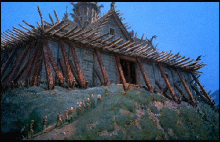
| Peter's concept painting for the Viking long house. I wished they'd have adhered more to this wonderful design than the one they eventually did utilise, as shown below. |
 |
| The Viking village. Combination backlot foreground, Norwegian background plate and painted structures and other mid frame additions. Note the houses look entirely different to what is shown in the earlier long shot. |
 |
| One of several conceptual suggestions for the approach to the city sequence. I rather like this one, especially the peaks. |
 |
| Most viewers favourite shot, including Harrison's. "I love this shot. Alan let me do the layout and block in for this shot. It just sort of worked from the beginning, probably because the production designer (Peter Ellenshaw) had done a very good sketch in pre-production. So, I picked out the background still and I had lined up the live action and I thought I'd done an excellent painting to bring it all together, but somehow it wasn't as perfect as it should have been. Finally Alan worked on the painting for about an hour... and 'voila', he added the magic that made it work." |
 |
| A rare glimpse of the same painting while propped up against a wall in the Buena Vista Visual Effects matte room circa 1996 |
 |
| My God, I love this. An awe inspiring concept painting by Peter which just sends ones' imagination into full flight. Doesn't this superb vision just transport you away to lands of fantasy and sheer magic. Genius! |
 |
| A typically 'ballsy' Disney matte where everything is painted except some RP people added in. Although it never occurred to me, Harrison pointed out that the timber suspension bridge has no ropes on the other side! The live action plate was shot atop of the Disney garages at Burbank, an area commonly referred to as 'The Sheds', a covered parking area reserved for studio big shots (no apprentice matte artists allowed). |
 |
| I really like this matte by Alan Maley as it doesn't draw attention to itself and is very well executed. The Viking ship, lake and mountains are all 2nd Unit plate shot in Norway. |
 |
| A beautifully 'raw' and loose painting that says what it needs to in broad, occasionally visible brushstrokes - but it works a treat. This tilt down composite involved in this instance just two passes on the matte camera by utilising a 'lo con' RP process plate. "If we used a single low contrast (lo con) print of the live action elements for our rear projection line up and compositing instead of three YCM's, each of which would need to be run separately, this would reduce the number of required repeatable moves by 2 and save time." |
 |
| Medium and close shots from the same sequence. I like the architecture here. |
 |
| The quintessential 'castle on a hilltop' matte shot painted by Alan Maley, and a beauty it is at that. Wonderful design and composition here. |
 |
| Before and after blue screen travelling matte process with painted matte of town below. |
 |
| Another stunning shot from the Disney matte department. |
 |
| Nice perspective painting but a very poor marry up which could have worked better had the matte line been better concealed around the straight edges of the doorway. The RP process for comping painted mattes seems to often come adrift when merging very dark elements against one another with the duped blacks just not holding up well. THE BLACK HOLE while being beautifully painted has this problem with many of the darker hued marry ups sadly. |
 |
| The temple interior looked sensational in conceptual form as seen here, but I feel failed seriously in final execution. |
 |
| The interior composites with skewed colour hues and awful washed out elements which may be the result of unbelievably poor timing of the print used for DVD transfer. Note the difference in the same matte shot below lifted from the trailer. |
 |
| Improved view of the same matte composite as seen in the film's trailer where hues are more balanced and the painted people blend in somewhat better. |
 |
| Effective as they may seem, the Godi's flaming eyeballs are in fact a mishap in the pulling of clean mattes during the photography stage. The flawed comps looked so nicely dramatic that they left the shot 'as is'. Note serious matte bleed through in his hair as well. For really, really bad 'matte bleed' see Spencer Tracy's silvery hair and parts of his face turn translucent in Columbia's THE DEVIL AT 4 O'CLOCK Wow!! |
 |
| Very nice, well integrated and composited matte shot from the effects heavy mountain trek sequence. I think Peter Ellenshaw painted this shot and a dozen or so subsequent mattes in the sequence at the top of the climb. |
 |
| More from the mountain trek with a surprisingly mismatched comp at upper right. Still at lower right shows a typical travelling matte set up being photographed. |
 |
| Peter Ellenshaw's preliminary conceptual art for the sulfur field volcano sequence. What a magnificent sketch. I'm constantly swept away by Peter's decades worth of pre-production art almost as much as I am by his finished mattes. |
 |
| Several frames from the sulfur field trek- all painted by Peter Ellenshaw during the final few weeks of post production. |
 |
| Now, I don't know if it's due to the RP comping process or flawed mastering of the 35mm elements for home video, but for a shot like this to stand out like a sore thumb is pretty unacceptable. ISLAND isn't alone though in this problem. Hitchcock's NORTH BY NORTHWEST has several mattes much like this which scream out at the viewer for better compositing, with ugly washed out live action plates that don't sit well with the painting. |
 |
| A terrific effects sequence here, with excellent and very convincing miniature lava flow beautifully shot and composited with a terrified Donald Sinden and pals. The lava flow was created by Danny Lee on a miniature set constructed on clear plexiglass sheets. Carbopol was mixed to a lava like consistency and colourless. Hand traced roto mattes were made to isolate the lava leading edge from the miniature set. The colour and intense glow were produced by double exposure - one exposure with a glow glass and one without. Nice work indeed which harks back to Disney's earlier IN SEARCH OF THE CASTAWAYS in terms of top shelf visual effects work. |
 |
| A neat touch here, as Sinden clambers to safety the lava flows past, complete with an old school Josh Meador-esque touch of having subtle effects animation of the glowing lava gradually sweep along the rock face. I've not seen anything this subtle from The Mouse Factory since the exquisite soap bubble fx animation in THE GNOME MOBILE years before. |
 |
| More from the lava flow. Great lava effects and, at bottom right, a first rate comp of miniature and live action that kind of makes up for the dodgy comp mentioned earlier. Excellent work! |
 |
| Another sensational and beautifully designed matte, probably one of Peter's shots. |
 |
| Two stunning painted mattes and a pair of badly lit TM studio composites. Why is it that every Disney film of the 70's sounds as though all of the dialogue is not only looped to death, but sounds like it's been re-recorded down a drainpipe with dreadful, hollow acoustics that don't in the slightest resemble actual environs? Nothing to do with mattes I know but this, and people who NEVER finish their drinks in movie barrooms really annoys me no end. |
 |
| Personally, I love this matte and the one immediately following as true examples of just how relatively random brush strokes and appropriate values can sell the audience on buying the scene. Possibly the best shot in the film in my book, and one of Alan's best mattes ever. |
 |
| Another ripper painted by the talented Alan Maley - an illusionist taken far too early from this world. Here's a straightforward matte painting which for me just works so elegantly. |
 |
| More Maley shots from the same sequence with top right and lower left being frames from the same quick whip pan from crater to rim. Harrison told me the move was done by hand in 4 passes and was "Very nice work". The lower right frame showing the adventurers climbing down a huge ice crystal is a tricky yet effective combination of large miniature set with the actors photographed on a blue screen column of the same dimensions as the miniature crystal. This shot was also embellished with a matte painting to help tie the elements together. |
 |
| Miniature ice cavern measuring 6x4 feet and made from clear resin with actors skillfully matted in. Good lighting match and blend. |
 |
| More from same sequence with miniatures and cast doubled in. I suspect that the shot on the right is a partial painting - part miniature with the painting applied to the foreground cavern above the RP actors as an aid to maintaining depth of field. |
 |
| And we're back to the very poor washed out matte comps which seem mostly evident in darker shots. There's alot to be said for original negative matte photography. |
 |
| Collapsing miniature ice cavern. |
 |
| Looking for the exit. Almost all paint except for narrow strip of live action. |
 |
| I asked Harrison about this shot: "This bay of whales may have been done by Matt Yuricich but I tend to think it's Alan's work as it looks more like his style. Nice mist overlay." |
 |
| Stuck on an iceflow. Shame about the none too subtle RP element where seemingly little attempt has been made to soften or 'feather out' the blend between process and paint. |
 |
| Great shot - all paint with lovely slot of sunlight peaking through the clouds across the ice. |
 |
| Matthew Yuricich painted this substantial full matte which was then photographed 'as is' with a realistic pan and tilt move. |
 |
| Peter Ellenshaw's concept painting for the bay of whales. |
 |
| Danny Lee's mechanical killer whales which look pretty good but are ill served photographically by the poor depth of field and choice of focal length in some of the shots involving miniature whale puppets. The long shots of the whales shooting out of the water look good. The large whale was some 24 feet long and consisted of two parts - the head and the tail, both of which were mechanically controlled by Lee and his crew. The smaller miniature whales were built in 1" scale and were also mechanically controlled to jump and swim quite realistically. The sequence was shot at 96 fps in a 30x40 foot tank with moving mist optically bi-packed later. Harrison commented: "It's too bad the miniature high speed footage doesn't hold depth of field, but that's the compromise of high speed cameras only being 35mm, as there were no VistaVision or 65mm high speed equipment made back then, and no decent high speed stock either". |
 |
| 'Da Dum.........Da Dum Da Dum........Da Dum Da Dum Da Dum Dum Dum............' |
 |
| Great volcano element and another one of those odd colour mismatch screw ups in the stage photography(???) |
 |
| Miniature of The Hyperion with a matte painting of the Captain and the poodle - both standing very still!! Moving mist was painted on a foreground glass for an altogether good trick shot. |
 |
| Excellent miniatures and camerawork here. Ex-Pat Englishman Terry Saunders built the miniatures and according to Harrison was an amazing model maker and mechanical effects person. |
 |
| High speed miniature photography by Art Cruickshank. |
 |
| The flying rig attached to The Hyperion on the Disney lot. |
 |
| Assorted ISLAND imagery, from large scale mechanical whale heads to very early advertising concept art. Yep, we've got it all at NZ Pete's Matte Shot blogspot! |
 |
| "It's them!" Godi and all his men on the cliff top is entirely painted, complete with moving mist on a foreground glass. |
 |
| Full painting with 3 campfires doubled in photographed with a hand operated camera move. |
 |
| Nice FX shot! |
 |
| All good zeppelins must come to an end...... oh, the humanity! Actually think this shot looks great and those flames, though not especially credible, look just sensational. Peter Ellenshaw and Danny Lee made a similar flame sequence in the earlier Disney show BULLWHIP GRIFFIN so I wonder whether some stock footage has been reused here maybe? |

 |
| A page from the impressive souvenir booklet which accompanied the film on first release. |