 |
| Mark at work on one of the matte painted shots for the Sylvester Stallone picture DEMOLITION MAN (1993) |
 Mark has long been a supporter of this blog and I've always enjoyed our conversations. I would like to express my sincere gratitude to Mark for taking the quite considerable time in not only answering, correcting and expanding the 40 odd pages of questions, but also for tirelessly scanning and sharing with me hundreds of rare frames, clips and photos especially for NZPete.
 Thank you Mark... a Prince among motion picture magicians.
Restless At Night: A conversation
with Matte Painter and Visual Effects artist Mark Sullivan
--------------------------------------------
Q: Firstly
let me say just how thrilled I am to feature you on my blog, Matte Shot, and to
be able to have these conversations with you.
I’ve long been an admirer of your work in this field.
 |
| Just out of frame may be a half buried Statue of Liberty... think about it. |
A: Thanks, Pete. I always enjoy your blog.
You dig up some great stuff.
Q: Thanks for that Mark. It’s always so heartening to get the ‘thumbs
up’ from industry professionals. So, let’s
start at the beginning.
Which part of the States do you hail from.
A: I grew up in Ohio, in the midwest. We
had long gloomy winters, so the sometimes unfriendly weather forced you to find
indoor hobbies.
Q: I
take it you’ve always had a lifelong interest in cinema as a viewer. What are the films, of the non-special effect variety are you fond of Mark.
A: That’s hard to answer, because there are
so many films, from so many eras that I like. In terms of a favorite
genre, I enjoy a lot of the hard boiled
crime dramas from the 1940s. A favorite
era are the early thirties pre-codes: THE WORLD GONE MAD, THE MIDNIGHT CLUB,
THE BLESSED EVENT, BED OF ROSES, CALL HER SAVAGE, BLONDE CRAZY, BABYFACE, NIGHT
NURSE, I AM A FUGITIVE FROM A CHAIN GANG, to mention a few. Most of my all time favorite actors seem to be
in 1930s movies. James Cagney, Myrna Loy, William Powell, Joan Blondell,
Barbara Stanwyck, Cary Grant, W.C. Fields, Paul Porcasi, and Edward G. It can’t
be nostalgia, I wasn’t alive way back when these movies were made.
Q: So you’d no doubt like things like
Cagney’s WHITE HEAT – one of my all time faves.
Of course THE THIN MAN is the perfect companion piece to many of the
films of the period too.
 |
| Mark, circa 1982, armed to the hilt with sable brushes. |
A: Pictures like those two are just
masterpieces of casting. From the leads to the bit players.
Q: It’s
always so hard to pin down one’s all time favourites, as opinions change over
time and the odd film dismissed as just another film back in the day can sometimes
be dusted off much later as something of wonder. I did that just the other night with Costa
Gavras’ political masterpiece ‘Z’ and
the brilliant Richard Burton thriller THE SPY WHO CAME IN FROM THE COLD – both
intelligent, gripping stories which left an indelible, potent impression upon me and stayed with me for
days afterward.
A: I can understand that. I go through phases of being preoccupied by
certain genres of movies. I have a
friend who is a collector of 16mm film prints. We’ve watched a lot of “heist”
movies: ARMORED CAR ROBBERY, GRAND SLAM, THE BURGLARS, THE MASTER TOUCH, THE
HOT ROCK, CRISS CROSS, GAMBIT. It’s fun
to anticipate the similarities, and the surprises of new twists that the film
makers have to come up with.
Q: I love heist flicks too. THE ITALIAN JOB and THE DAY THEY ROBBED THE
BANK OF ENGLAND are two terrific British heist shows and of course the
wonderful French thriller RIFIFI.
A: Yes!
LEAGUE OF GENTLEMEN is another great one (not to be confused with a
similarly titled film from 2002).
 |
| "My high school had a nice metal shop, so in my freshman year, I made friends with the shop teacher, Mr Bankes. He let me work in the shop during my study halls, building armatures. The goofy four armed mutant dinosaur creature in this picture was my first ball and socket armature. I'd read that Kong was eighteen inches tall, so I just had to make my model the same height. At right is a practice matte painting also from this time - around 1975". |
Q: Of
course it’s true that many of the films we saw at a formative age – such as
PLANET OF THE APES, LIVE AND LET DIE, SEVEN DAYS IN MAY, TAKE THE MONEY AND
RUN, A DAY AT THE RACES, JOURNEY TO THE CENTRE OF THE EARTH, NETWORK and TORA
TORA TORA to name but a few of my faves, always remain fresh and as good today
on the twentieth viewing as I recall them as being when I was 12 or so.
A: I never tire of the 1940 THIEF OF
BAGDAD, IT’S A GIFT, THE THIRD MAN, GENTLEMAN JIM or KING KONG.
Q: We’re on the same wavelength there I
think Mark. I know it’s off topic, but
some of this old stuff you outlined is just still so satisfying. For me, so essential I just couldn’t imagine
life without the joyous insanity of The Marx Brothers, which no doubt says a
lot about the mindset of your interviewer!
A: I grew up loving those Marx Brothers
movies, too. A local art theatre would occasionally run them. That’s where I
first saw KING KONG, it was paired with the Marx Bro’s THE BIG STORE! That’s an odd, yet very entertaining and
pleasing double bill!
 |
| "I was so excited by a Chesley Bonestell painting I saw somewhere, I tried to recreate it from memory in my eighth grade art class, using Prang Tempera paints". |
Q: I
always ask this question: what were the
films that made sufficient impact and lit that special effects curiosity in
you. For many in the effects business it
seems that KING KONG, 7th VOYAGE OF SINBAD and JASON AND THE
ARGONAUTS are titles which come up often.
A: I saw KING KONG and 2001: A SPACE
ODYSSEY at a young, impressionable age. Both of those films feature vast,
exotic, imaginary vistas. I think I
became equally fascinated with the settings as much as with the characters in
films, which may be a bit odd, but is probably appropriate for a matte artist
or art director or visual effects creator. I suppose it is all what my friend
Stew McKissick calls imprinting.
Certain films and images viewed at a certain age may help to form one’s psyche.
Q: Right on the money Mark. From our previous conversations over the past
few years it’s clear to me that you still value and hold deep appreciation of
the Golden Era of trick photography and the practitioners therein.
A: Some of that may be the imprinting thing
again. If you wanted to make your own movies, or experiment with your own
effects shots, it meant buying film, lumber, paint, glass, foam rubber and
aluminium, and learning how to use tools.
I was in my early thirties by the time the digital effects era seemed to
gel. I was formed by the world I grew up in.
 |
| Mark painted this very Wagnerian influenced scene while at high school. |
Q: I
recall chatting with you years ago on the StopMotionAnimation
forums – back in the good old days when it was an essential fountain of
information on matte painting and other effects though they did some sort of
‘social network’ reboot of the site and scrapped all of those decade worth of
valuable old posts and hundreds of photos.
Such a waste.
A: I think it may have been beyond the
control of the fellow who maintains the site. But yes, there was quite a
collection of matte shot frames amassed there, mostly by you!
Q: Anyone
who reads my blogs will know that I am a huge supporter of the great pioneers
in trick work such as Frank Williams, John Fulton, Arnold Gillespie, Percy Day,
Jack Cosgrove, Willis O’Brien, Roy Seawright, Fred Sersen, Gordon Jennings,
Clarence Slifer and Norman Dawn. I never
cease to be thrilled to discover and learn more about the work these guys did
in advancing the medium, and I try to pay tribute as often as possible.
A: Yes, I hope you keep posting more
material on such pioneers.
 |
| A pair of paintings created by Mark for a Super 8mm project in 1975. |
Q: I
feel so fortunate in that through my blog I’ve been contacted by the family
members of many of these ‘giants’ who
accidentally stumble across this blog. I’ve had interesting conversations with John
Fulton’s daughter, Buddy Gillespie’s grandson Robert, who has been incredibly
generous; also family members of Wally Veevers, Les Bowie, Mario Larrinaga, Warren Newcombe, Irmin Roberts,
Fred Sersen and Gordon Jennings – all old school big players and some of whom
have interesting anecdotes, memories and in some cases, memorabilia which they
share with me occasionally with some most interesting material coming to light.
A: I’m looking forward from what you may
share from those contacts. I was amazed at all of those great test frames you
displayed of Jan Domela’s work, especially those shots from the 1930’s
Paramount features, which are so difficult to see nowadays.
 |
| A series of sketches prepared for various student film ideas around 1981. |
Q: There is so much stuff that never made
it to DVD or even tape for that matter.
A: It seems that more and more little seen
films are getting onto DVD at last. But
those Paramount and non horror Universal pictures from the 1930s may be a
while.
Q: I
still find myself literally ‘gob smacked’ with so many of those classic effects
films and shots – the phenomenal smoky transformation and departure through the
jail bars in SON OF DRACULA is a John P. Fulton photochemical masterpiece and
to me has never been equalled, even with the digital realm. I’m
sure Universal’s long time visual effects cinematographer Ross Hoffman would
have had a lot to do with that.
A: Yes, I remember that one! That shot of Louise Allbritton
dematerializing into the floating vapours amazed me. How’d they ever get the
smoke lined up, and moving in such a perfect way, I’ll never know. Did they
have smoke trainers? I’d thought that
was probably one of the finest effect shots accomplished by Fulton’s team, at
that time at Universal. The Doctor Pretorious sequence, featuring the homunculi
in the bottles, in THE BRIDE OF FRANKENSTEIN is another Universal effects
department tour de force.
 |
| Mark at work on a remarkably good Mario Larrinaga-esque New York skyline backing for his stop motion high school King Kong project in 1976. |
 |
| The final shot, complete with an updated 70's Fay Wray damsel in distress. |
Q: How
about the astonishingly realistic burning of Chicago by Fred Sersen and Ralph
Hammeras in IN OLD CHICAGO and their equally thrilling deluge in THE RAINS CAME
– they’re still as good as it gets Mark, with staggeringly ambitious optical
work amid the excellent miniature destruction.
This stuff still holds me with a profound sense of “how the
hell did they do that?” even today – with very little of the
new age digitally manufactured stuff possessing that same sense of wonder.
A: You said it, Pete! I recall seeing a nice 35mm print of THE
RAINS CAME in the 1980’s at the Los Angeles County Art Museum. THE RAINS CAME
is a thesis on imaginative, dramatic and resourceful visual effects shot design
and application. Fearless!
Q: One
of my all time favourites in special effects and pure adrenalin has to be
THIRTY SECONDS OVER TOKYO with some of the very best miniature and matte work
committed to the screen. Have you seen
that show.
A: Oh sure!
I think I’ve seen some behind the scenes photos of the MGM effects crew
shooting the bomber POV shots. Huge miniatures!
Right out in the sunlight.
Q: I’d
be very interested in a rundown of some of the great old school effects shots
you’re particularly keen on.
A: I
always enjoy seeing a puzzler, one that you just can’t seem to break down and
reverse engineer. The shot of Tyrone
Power on his horse, leaping off of the bridge in MARK OF ZORRO is certainly one
of those. The zoom and dolly into the telephone booth on the lakeshore, as seen
from the boat deck in A LETTER TO THREE WIVES is interesting. Was the zoom built into the process plate as
shot on location, or was it a dolly shot with the camera pushing towards the
process screen on the stage floor at Fox?
You’ll sometimes see flawless travelling matte shots in pre 1933 movies,
before the common and widespread use of rear screen process shots. There is an amazing travelling matte of
Carole Lombard riding in a taxi, in VIRTUE, a 1931 Columbia photographed by
Joseph Walker. It doesn’t at all look
like a dupe, but as the shot goes on, you sometimes see a little transparency,
which is the only tiny giveaway.
 |
| Hornet's Nest - an art school painting that Mark did in 1979. |
Q: Yep, Frank Capra’s THE MIRACLE WOMAN
made in 1931 had some great travelling matte shots with Barbara Stanwyck in a
burning church - maybe Dunning shots?
A: An
approach I really enjoy seeing sometimes is where the crew tries something very
audacious, perhaps beyond their resources. You can imagine someone saying, “This may not end up looking completely realistic, but it’ll be a
helluva shot, let’s do it anyway”. There are some startling scenes in THE
DAMBUSTERS that might be in this category.
The work in Howard Hughes’ HELL’S ANGELS was gutsy as, well, hell.
Q: Of course – HELL’S ANGELS. What an incredible film. The special effects work was Oscar material
in my book. Utterly superb miniature
cinematography, mechanical effects and composites by Roy Davidson and Cecil
Love.
A: I
recall seeing GREEN DOLPHIN STREET on television one night when I was a
teenager, and being blown away by some of the disaster sequences.
Q: Me too.
The MGM big screen RP shots were really impressive there. So crisp and
well balanced. Arnold Gillespie was a
genius at knowing where to blend the RP screen with the stage set, with some of
those shots having practical gags thrown into the shot in front of the process
screen. Terrific!
 |
| In 1980 Mark embarked on an ambitious 16mm short film titled HIGHRISE, where a number of split screens, glass shots and miniatures were employed to imaginative effect. |
A: The
orphanage sequence in the 1949 MIGHTY JOE YOUNG always excites me. Now there’s
a sequence with almost every trick in the book: stop motion, matte paintings,
high speed miniatures, travelling mattes, back projection, static mattes, all
used in imaginative and exciting camera angles.
Q: Oh yeah.
I’d love to see a full breakdown or before and after reel on that
sequence. I have to gasp though where
that stuntman falls and actually breaks his ankle, right there on camera! Ouch!
A: Sometimes I’d rather not know of certain
things. It makes me a little uncomfortable seeing that shot, knowing the
stuntman was injured.
 |
| A before and after tabletop set up from HIGHRISE. |
Q: Didn’t
you once tell me about that great camera move in SVENGALI – where the camera
pulls back from the ultra close up of the guy’s face, across the room, out the
window and carries on as a flight over the rooftops of a miniature city? I saw that one recently and it blew my
mind.
A: I might have, that’s another favorite
movie. There is a picture of Anton Grot working on this set up in a Kevin
Brownlow book. Looks as if the whole
thing is a forced perspective miniature built around the full scale window that
the camera dollies out of, from an extreme close up of John Barrymore. Grot’s
set designs in this one are astounding.
 |
| A dramatic full matte painting also from HIGHRISE which is just the sort of shot I'd loved to have included in my recent 'Perspective Matte Shots' blog. |
Q: Being
a Warner Brothers show it’s really no surprise that such a fluid and high
concept illusion was pulled off so well.
That studio’s famed Stage 5 Camera Effects Department run by guys like
Fred Jackman and Byron Haskin really made a name for itself for a couple of
decades with jaw dropping effects shots – many of which I’ve elaborated upon on
this very blogsite. Stuff like YANKEE
DOODLE DANDY and PASSAGE TO
MARSEILLE still floor me with their eye popping trick
photography.
A: Yes, it seems like the WB effects stage
was really cranking up and doing matte shots at a fever pitch by the
1940’s. Pop in a DVD of one of those
Raoul Walsh directed Errol Flynn movies, like NORTHERN PURSUIT, or DESPERATE
JOURNEY, and you’ll see a heck of a lot of miniature and matte shots. I think there are even some shots in
DESPERATE JOURNEY with a sky matte painting being tracked to the plate, shot
with either a panning, or tracking camera.
 |
| Mark would learn not to screw with the lens f-stop setting as he found with this shot from HIGHRISE: "After doing three versions of this shot, each time going to the location, taping off the matte box for the split, filming the location, then later taping a counter matte back home, lining up the camera and animating the building model, I learned the hard way that you DO NOT change the f-stop between exposures (if you are using mattes for a split screen)! It should have been obvious but I didn't know better. When I changed the f-stop to accommodate the amount of light I had available for my animation set up, doing so changed the shape of the counter matte and ruined the 'fit', making an enormous matte line". |
Q: I’ve not seen NORTHERN PURSUIT and must
find it. DESPERATE JOURNEY had an
effects nomination I think.
A: I did not know that!
Q: Now,
was there ever a particular matte painted shot in any film that really sold you
on the process as a career.
A: Probably
the view of Kong’s grotto in the 1933 KING KONG. The effectiveness of that
environment is spellbinding. It is a supreme example of an almost impossible
dream like setting lucidly portrayed on film. Too bad KONG was made so long
after Gustave Dore passed away. I think he would’ve been impressed.
 |
| Also from HIGHRISE Mark commented: "A location glass painting for my 16mm short film where I goofed up on the color of the painting. The distant mountains should have had a colder, cobalt blue hue, while the lower area of the sky should have been painted a warmer, less saturated blue. I had them reversed". |
Q: Tell
us if you will Mark, a little about your background prior to entering the industry.
A: A very happy childhood, I think my
parents indulged me, but didn’t spoil me. Cats, dogs, ducks, hikes, bicycle
accidents and vacations. My main hobby
during grade school was building model trains, and collecting dinosaur
stuff. I saw the 1933 KING KONG (the
real one) when I was 12, and a year later I discovered Ray Harryhausen’s Film
Fantasy Scrapbook in a bookstore. Those events got me excited about movies.
Q: Art
has always been a strong part of your life I take it.
A: I think so, but sometimes not in a
conscious way. I grew up near a railroad and became fascinated by trains and I
enjoyed sketching them, but I was doing the sketches because I was interested
in the trains, more than producing a piece of art. I think it was the same way I got into
painting. I needed to create painted backgrounds for my Super 8 shots of clay
model dinosaurs. I was only interested
in making a background, and didn’t view the painting as a piece of art, really.
 |
| Another glass shot from the student short film HIGHRISE |
Q: Did you ever have any formal art
training?
A: There happened to be a pretty good art
school, right in my hometown.
I think the foundation
year program was very helpful. It consisted of color theory, two dimensional
design, art history, painting and figure drawing classes. But after three years
I felt the classes were becoming too focused on theory and offering fewer
practical things I thought could be useful for doing any kind of work
associated with the film industry. So at that point, it seemed like a good time
to move to Los Angeles.
Q: So
in your own non-film related art are you an Oil or Acrylic advocate. Do you have gallery shows of any of your
work.
A: I’ve always viewed acrylic as a way to
allow the painter to work a little faster - you don’t have to wait very long
for areas to dry before you can work over them.
I generally prefer the look of oil paintings, so if there is time I like
to use oils. I’ve been working on
various paintings over the years that I would like to display in a gallery at
some point.
 |
| Matte art and stop motion figure from Mark's 1976 interpretation of KONG. |
Q: What
genre or school of painting do you follow in your personal art.
A: I enjoy so many varied types, themes and
genres of art, it’s hard to answer. But
if I had to point at some group, I ‘d pick the work of many illustrators from
the first half of the 20th century: N.C. Wyeth, Haddon Sundblom,
Gerome Rozen, Dean Cornwell, Maxfield Parrish, Fredric Gruger, Andrew Loomis,
Hugh Ferris. I love a lot of the Victorian and Symbolist painters, too: Arnold
Bocklin, Giovanni Segantini, Jean Leon Gerome, Sir Lawrence Alma Tadema.
 |
| Mark worked on many commercials during the eighties, once his professional career kicked off, with this being one of several he painted for DODGE (1984). A beautifully painted and composited shot with exquisitely hand rendered marble. |
Q: So
at what point did you first experiment with trick photography. Super 8mm I guess, as many of us tried to do
in the 70’s. Did you graduate to 16mm.
A: I saved up money from mowing yards in
my neighbourhood, and after a while I
had enough to buy an inexpensive Super 8 camera. The Kodachrome film was
beautiful. Paul Simon had it right. But I was unhappy with the poor results of
trying multiple exposures, so that led me to get a Bolex 16mm, a few years
later.
Q: Back
in the seventies we used to try and make in camera split screens and such in
Super 8 but the backwind was always a son of a bitch, with only so much footage
‘re-windable’ as I recall – and registration was a problem, especially with
early attempts where we didn’t even have a ‘through the lens’ viewfinder – so
it was all guess work! I recall early
attempts were even on single 8 – you
know, the 16mm roll that you’d flip over and shoot both sides and then they’d
split the roll at the lab and you’d get an 8mm developed film back – albeit one
with huge sprocket holes.
A: I have to laugh, this is all so familiar
sounding! Yes, I tried the Super 8
backwinding trick. You’d tape over the cassette core driver, so the camera
couldn’t wind the film properly, and later take the cartridge into a dark
closet or someplace, and push the length of film back into the feed chamber,
and then shoot the second exposure. The
registration of the two passes wasn’t good, they would really be swimming all
around.
Q: I
was amused to learn from a much earlier conversation with you a few years ago
that a book I had always found incredibly instrumental in getting me buzzing
with special photographic effects trickery was Jerome Abel’s The Making of Kubrick’s 2001 had a similar effect upon you as a fledgling
effects artist.
A: As I recall, the book itself isn’t too
specific as to how most of the visual effects were accomplished, but it was
intriguing to see what generally went into the making of that film. Since it
was one of the first “behind the scenes” pieces I’d ever read, it made me very
curious how other films were made, too.
Q: I
still leaf through that book from time to time and see it as way ahead of it’s
time – as was the film itself – in detailing the methods used. I was fascinated, though a little
disappointed in the Cinefex special on 2001 as too much time had lapsed since,
and too many of the key participants had passed away whereas Abel’s paperback had Doug Trumbull describe all of
the effects shots in an extensive photo section.
A: I guess that’s the great thing about
some modern films on DVDs. The documentation extras made during, or shortly
after a film’s production.
 |
| Who ever said the effects guy never got the gal. Say's Mark: "Sometime in early 1983, I believe Jim and Karen Danforth had read of a planned screening of KING KONG, at the famous Hollywood Chinese Theatre, to celebrate it's 50th anniversary. Jim and Karen then had the inspired idea to recreate the full size Kong bust as it was for the original film and displayed at Graumann's Chinese Theatre's gala premiere, in May 1933. Many of Jim's friends took part in building the recreation. I sculpted the ears, painted the eyeball retina's, and helped glue some rubber skin. The completed bust was trucked over to the courtyard of the Chinese, right where the original had been displayed. Fay Wray and Ray Harryhausen were in attendance at the screening event, and many of the original O'Brien, Larrinaga and Crabbe design drawings and stop motion models were displayed at an exhibit across the street at the Roosevelt Hotel". |
Q: A
group of us were blown away by EARTHQUAKE in 1974 and tried our own 8mm version
– the results of which were generally dismal but kept a bunch of teenagers busy
with models, split screens, floods and hair raisingly risky live ‘stunt fire
gags’ and home made pyro….Jeepers!!! As
usual with these amateur projects it was never finished. Does this sound familiar I wonder.
A: I didn’t get too far with the pyro stuff
for my Super 8 movies. A friend of mine
and I burned down a neighbor’s pine shrubbery after one of our pyro shots got
out of hand. My parents closely
monitored me after that episode.
Q: EARTHQUAKE
most definitely set me on a path of following matte artists and that realm of
sleight of hand, with Albert Whitlock without doubt being the master who’s work
I find simply astonishing.
A: I think it was THE HINDENBURG that got
me interested in how Al was using a lot of imaginative applications to his
work. The way the Hindenburg was made to emerge from the clouds was especially
interesting and dramatic.
 |
| One of Mark's earliest professional matte assignments was to paint several mattes at David Stipes' effects house for a low budget show called WHAT WAIT'S BELOW around 1982. |
Q: Al’s
work on THE HINDENBURG was amazing, and it wasn’t until I spoke with Al’s
cameraman Bill Taylor a while back did I learn just how complex some of those
shots were – with the climactic explosion visual effect being something quite
extraordinary in concept and execution with multi plane matte art on moving
rigs and a series of cell painted direct overlays by Al frame by frame
animating the collapse of the airship’s envelope at the moment of
conflagration. Take a look at that shot,
it’s jaw dropping.
A: Dang!
Q: Speaking
of dirigibles, I think you told me recently that Disney’s ISLAND AT THE TOP OF
THE WORLD left an impression with
you at the time, effects wise and was a motivating factor toward
an effects career.
A: Well, after seeing KONG ’33, WHEN
DINOSAURS RULED THE EARTH, 2001, and MIGHTY JOE YOUNG in the late 1960’s to mid
1970’s, I was starved to see other adventure fantasy movies, taking place in
exotic lands. I enjoyed seeing ISLAND AT THE TOP OF THE WORLD enough, but it
wasn’t anywhere as startling and as formative as seeing KONG, for instance.
Q: Of
course Peter Ellenshaw would be an identity any budding matte painter would be
able to connect with – if not in person in inspiration and seemingly effortless
technique. Did you ever meet Peter.
 |
| Final RP comp of the WHAT WAIT'S BELOW matte. |
A: No, I never met Peter. I recall catching DARBY O’GILL AND THE LITTLE
PEOPLE when it was re-released, sometime like 1975 or ’74. It made a huge impression.
Q: I’ve
said it before and I’ll say it again Mark, Disney’s DARBY O’GILL AND THE LITTLE
PEOPLE remains one of the absolute top visual effects showcases of all
time. There really hasn’t been a serious
competitor in the field of in camera perspective trick photography until Peter
Jackson’s LORD OF THE RINGS.
A: I absolutely love the perspective and
matte painting work in DARBY O’GILL. I
was always surprised with the appearance and direction of the death coach. It’s
almost shocking that the Disney people would put something that frightening
into one of their movies! I am glad they
did. It heightens the drama.
Q: DARBY
still delights and stuns me to this day with it’s seemless trick work. The fact that no Oscar was so much as
nominated here is criminal.
 |
|
"Earthquake
’89. During my first few months at ILM,
my apartment was in the Marina district of San Francisco. This residential
district was built upon a landfill area, made a few years after the big 1906
earthquake and fire, by dumping the destroyed building remnants into the bay,
along the shoreline. This new artificial tract of land was first used for the
1915 Panama Pacific International Exposition, which was a world’s fair celebrating
the opening of the Panama Canal. Unfortunately, the landfill behaved like a
giant flexible sponge during the earthquake, and shook the pretty 1920s era
apartment buildings, including mine, to pieces. A few days after the quake, I
was able to get a permit from the city government to enter the heavily damaged
building and retrieve things out of my place with the help of some friends".
|
A: The Oscar process seems organic. A movie
just plain has to be popular, to get the popular vote. The bad deal was when
outstanding work, such as any number of Ray Harryhausen projects weren’t
suggested for nomination by the visual effects committee. Some other occurances
of fine work being slighted, to my mind, were CITY OF LOST CHILDREN, and the
recent version of CASINO ROYALE.
Q: I know the fx supervisor from the recent
Bond shows reads this blog so I’m sure Steve will be pleased at that
compliment. On Oscars, BLADERUNNER was another overlooked effects showcase in
my book, with sublime photographic effects work that always was complimentary to
the scenario and never oversold itself as modern films tend to do. I always felt Woody Allen’s masterpiece ZELIG
should have been considered as it’s as good a faux 20’s documentary you’ll ever
see. Staggering opticals by R/Greenberg
and cinematography by the great Gordon Willis at his very best.
A: ZELIG was such a fun idea, and well
executed, as you said. Excellent point about BLADE RUNNER. Visual effects in
modern films sometimes overstay their welcome.
A: No, I was in high school at that time,
in the midwest.
 |
| Rocco Gioffre and Mark Sullivan, circa 1986 |
Q: Of
course your friend Rocco Gioffre managed to get on board under Matthew Yuricich
for Spielberg’s CLOSE ENCOUNTERS OF THE 3rd KIND, and being a
natural talent, Rocco’s never looked back.
A: Yes, that was a great opportunity for
Rocco, and he obviously made the best of it.
He told me his first assignment, after arriving in Los Angeles, was
handing out candy at Matthew’s house to Halloween trick or treaters!
Q: Weren’t both Matthew and Rocco also from Ohio.
Sounds like a bit of a movie magician trafficking conspiracy to me.
A: Jim Danforth grew up in the Cleveland
area for a while, too!
Q: It
wasn’t long afterward of course when a number of future major matte painting
pro’s got their start such as Mike Pangrazio, Chris Evans and others.
A: The late seventies were the beginning of
a new visual effects boom.

Q: Tell
us how your first professional assignment came about.
A: My very first professional work was
creating some pre-production design art for a potential film project, that was
to be produced by a friend of Forry Ackerman, a man named Thad Swift. As you
know, Forry was a literary agent, and editor of the popular Famous Monsters of Filmland magazine, back in the 1960s and
70s. My friend Ted Bohus had visited
Forry, and showed him some slides of some of my amateur sci-fi paintings. As
per Ted’s suggestion, Forry was welcome to the idea of acting as my agent on
Thad’s project. Since I was still a
teenager in Ohio, without a car, my mom
volunteered to drive me out to Los Angeles, so I could work on the
project! That is some real parental
support. I did about 6 or 7 paintings
during July and August, 1979. They
weren’t my best because I may have been nervously trying too hard, but Forry
and Mr. Swift seemed fairly happy with them.
 |
| Mark painted this wonderful Moon Colony conceptual canvas in 1980. |
Q: David
Stipes still has fond memories of the superb glass shots you painted for his
effects house David Stipes Productions for a low budget show called WHAT WAIT’S
BELOW, in fact he still has one or two of them in near pristine condition in
his garage which he very kindly showed me, albeit with one small scratch in the
paint, which is no mean feat with storage of delicate glass paintings I’m sure.
A: David Stipes and Ernie Farino were some
of the first guys I’d made contact with when I relocated to Los Angeles. They
were helpful and kind. My longtime friend Ted Rae and his wife graciously
allowed me to stay in their apartment until I found one of my own. Around that time, Ernie gave me some work for
a couple days helping him paint some animation cels for an effects assignment
he had. A couple years later, I got the
chance to work with David on the BELOW caverns project.
 |
| Another glass painting painted by Mark for WHAT WAIT'S BELOW |
Q: Forgive me here, but the
first I’d heard the name Mark Sullivan myself was a small article about you in
a mid 80’s issue of Cinefantastique,
detailing your stop motion and matte art for the low budget film HOUSE 2, and I
was really so impressed.
A: Thank you Pete. HOUSE 2 was one of those
unique projects that I am fond of, more for the experience and opportunity than
the work I produced.
Q: You
seem torn between two poles Mark – that of being a stop motion animator and
that of a matte painter.
 |
| Stop motion set up for HOUSE 2-THE SECOND STORY (1987) |
A It’s that darn KONG influence again.
I’d always been excited by stop motion, in particular the work of O’Brien,
Harryhausen, Jim Danforth, Randy Cook, Randal Dutra, Phil Tippett. The
convincing illusion of a living, breathing, sentient animal, or creature. There
is that fascinating “dead can dance” aspect to stop motion animation. You start
with inert materials: metal, clay, paint, foam rubber, and form them, then
animate them to suggest something living, as recorded on film.
 |
| Combined stop motion brontosaurus action against painted backing, split screened with actors on a stage and flawlessly blended with matte art from the film HOUSE 2 - THE SECOND STORY |
 |
| Again, animation and artwork all by Mark from the same film. |

Q: I
was honoured last year to be able to conduct an extensive and richly rewarding
interview and career piece on Jim Danforth – most definitely one of the great
all round talents of the traditional era effects world without question. So at
which point did you join forces with Jim Danforth.
A: I was lucky to be hired by Jim around
July of 1982. This was about a month after I moved (back) to Los Angeles, (the
work for Forry Ackerman in 1979 was just a summer job). I had called and visited some effects
facilities in the San Fernando Valley.
David Stipes was especially helpful and encouraging to me. David
suggested I call Jim, as he knew Jim had some matte work on the horizon for
Columbia television. I called Jim, and visited with him and his wife Karen,
later that afternoon. I brought along a 16mm projector, to run a short film I’d
made as an effects demo reel.
Q: I’m
sure my readers would be most interested in Jim’s influence on you as a
technician and the collaborative partnership you developed. What are some of the key things you learned
that would help you hone your craft.
 |
| Mark's mentor and friend, Jim Danforth. |
A: I was enthused about getting to work
with Jim, and hearing his thoughts, opinions and advice on so many things.
There seemed to be two sides to the matte work we were doing. Of course, there
is a lot of technical knowledge that is required for putting these kinds of
effects shots together. I had only a limited knowledge of photography, so there
was I lot I needed to learn.
The second side of the work was much more
intangible, what might be called making artistic decisions. I might have been
painting a hue that may have been inappropriate near a horizon, or
inadvertently painting some patterns forming a tangent, or setting up a run off
composition. Jim would point out such things, and suggest corrections in a
clear, informative way. As we have seen, especially in the last thirty years,
technologies come and go, but if you can learn some artistic “picture making”
fundamentals, you can and will use them all of your life. Jim was insightful and helpful to me with
this difficult aspect of the work .
 |
| At Jim Danforth's Effects Associates, Mark Sullivan adds some finishing touches to one of the joint collaborative glass paintings the duo created for the TV series BRING 'EM BACK ALIVE (1983). Photo courtesy of Jim Danforth. |
Q: Runs
us through the various projects if you will that you worked on for Effects
Associates, and any other outside work around this time.
A: The main, ongoing project was the BRING
‘EM BACK ALIVE television series. There were usually one or two shots per
episode. There was also some matte work on a made for television movie, a
western called SHADOW RIDERS. Jim created an ingenious split screen shot that
fused two locations into one, and there were two matte painting shots depicting
a schooner anchored off a coastline. Jim
painted one, and I the other. That was my first professional matte painting.
Another project at that time was a matte of a view of Manhattan for a Columbia
Mickey Spillane telefim. Jim shot the
plate down in Long Beach, and let me do the painting.
 |
| Wonderful matte art for a minor made for tv movie, MURDER YOU, MURDER ME (1982) |
 |
| ...and the final composite |
Q: I don’t think we ever had those shows
down here in NZ. BRING ‘EM BACK looks
great in terms of trick work from what Jim showed me, which I’d have none the
wiser of.
 |
| BRING 'EM BACK ALIVE trick shot. Photo courtesy Jim Danforth. |
A: Well,
it wasn’t the most popular show in the states, either, it ran only one season.
I liked it, it reminded me of an old Republic serial. Some of my projects helping with the BRING
‘EM BACK shots weren’t just painting. I made some tiny stop motion parrots for
animation in front of a jungle painting, and there was a shot in a particular
episode that had to show Frank Buck jump a ravine on a motorcycle with a
sidecar, Evel Kneivel style. Jim was
creating a matte painting of a steep, rocky chasm. My part of the project was to do a tiny
painting of the motorcycle and stuntman onto cardboard. I cut the painting out, and made a paper doll
type of animation puppet out of it, even with some separate sections of the
motorcyclist wired from behind, so that
Jim could animate the body shifting to the changing angle of the bike as
it flew over the chasm. The little cardboard puppet-model was hung on tiny,
nearly invisible wires in front of the matte painting. The point of making the
painted cut out was to save time, and with painting it, it could be made to
closely match the motorcycle and rider seen in the surrounding cuts.
 |
| Creating big scenics from the basics: "I was having lunch one day with Jim Danforth when we were working on BRING 'EM BACK ALIVE. I mentioned to Jim that there appeared to be a cascade of fine sand falling down a rocky slope in a live action scene from WHEN DINOSAURS RULED THE EARTH. I was puzzled if it was intended to be real falling water, or if there was just some kind of silt that was somehow there, drifting down. I think the discussion may have started Jim thinking about the concept of shooting a 'dry' waterfall to use as an element in one of the BRING 'EM BACK shots. I carved and textured some styrofoam that was glued to a four by eight foot sheet of plywood and suspended upright. While Jim had his Mitchell camera cranking around a hundred and forty frames per second, I dumped a few pounds of a flour and salt mixture over the side of the cliff mock up." |
One amusing detail about Jim’s studio,
was that it was next door to an exotic bird importer. The effect of hearing the many birds squawkng
around three in the afternoon, which must have been their feeding time, helped
to put me in the mood when we were working on some of the jungle scenes.
 |
| The elaborate palace glass painting by Mark for BRING 'EM BACK ALIVE (1982) |
 |
| The final rear projection composite. |
About the
time work concluded on the television series, Jim took on a complex shot for
TWILIGHT ZONE: THE MOTION PICTURE. The
shot basically represented a point of view angle as if the viewer were perched
on the wing of an airliner, descending through thinning clouds that reveal an
airport runway. Jim discusses this project, with some pictures, in your
interview with him, from May of 2012.
We worked on a couple matte shots for an
Andrew McLaglen directed film called SAHARA, not too long after the Twilight
Zone project. An exciting, ongoing project at that time was JONGOR, a film
project Jim wanted to launch, based on a popular pulp novel series from the
1930s. I painted a jungle, about eight feet wide, that was to have been used as
a backing for a stop motion miniature set up of an encounter between a giant
monitor lizard and an Arsinoitherium. Jim painted numerous, beautiful design
paintings, but things happened and I think he lost the option on the stories.
 |
| Original matte art from the Brooke Shields adventure SAHARA (1983) |
 |
| Composite of same. |
 |
| Another matte comp from SAHARA (1983). Interestingly, the director, Andrew V McLaglen - the son of actor Victor McLaglen - would on practically all of his films with matte requirements of the 60's and 70's request the services of Albert Whitlock of whom he held in high regard. |
Q : From
what I gathered from my conversations with Jim Danforth, many of his mattes
were assembled as rear projected composites with quite a lot of success.
I’ve seen some RP matte comps on other shows which scream out ‘process’
with muddy colours, grain, hot spots and overall softness; so what made Jim’s
work so good.
A: Yes, Jim was very knowlegable and adept
at the process. He’d created many matte shots that one would assume were
original negative, because the color and clarity was so good. Something that was really fun about painting
onto glass, in front of a back projection screen is that you could thread up
the plate into the projector, put the glass painting in the matte stand, start
painting, then walk over near the camera, and see for yourself the illusion of
the painting placed over the film plate. Instant gratification!
 |
| A gorgeous Hawaiian sunrise matte painting from a 1984 DODGE television commercial. |
Q: From
what I gathered from Jim it was common for the pair of you to paint on the same
matte shot. How difficult was that. Was
it a case of you doing your bit and then Jim having his input later, or were
you literally elbow to elbow.
A: Mostly the former. Sometimes I would come in on a Monday, and be
amazed at a painting Jim had created during the weekend. Like Al Whitlock, or Peter Ellenshaw, Jim
could work very fast. Sometimes I would
rough in a painting, and Jim would complete it, or sometimes I would go all out
on a shot, and Jim might make some changes, or refine an area where I might
have had some trouble with the perspective, or made some poor compositional
choices. We had to work fast on the television series shots. There might have
been instances where a completed shot for the Thursday night broadcast was
delivered on a Monday or Tuesday. Jim
worked hard on making the process projection plates. Sometimes he would create a built in contrast
mask, or sometimes the negative black and white contrast mask element would be
bi-packed in the process projector, with the positive projection print. The contrast masking would put information
into the highlights without adding density into the shadows, and blocking them
up. The end result of what was being projected onto the process screen, behind
the glass painting, looked almost like an interpositive, but without the orange
base. In terms of boosting shadow
information, Jim might have been using a slight flash. Of course, the masking and flashing work was
to preserve image information, so the duped image didn’t look contrasty. Many color filter and density tests were run
to achieve the perfect color balance.
The dupe plate test strip would be compared to a correctly timed
workprint on a lightbox. I think the
main reason Jim needed a hand with the paintings is that the optical work he
was doing with the plates was time consuming.
 |
| An eight foot wide jungle painting for JONGOR, a film that Jim Danforth was trying to get rolling in 1983. |
Q: Many
matte studios would pass an individual painting among several artists. The Wally Veevers department at Shepperton
did this as did Albert and Syd at Universal and Illusion Arts. I think Yuricich said this occurred too at
Fox under Fred Sersen, though it got pretty damned competitive under Emil Kosa.
A: That was probably necessary when a lot
of work had to be done in a short time. Sometimes sharing the paintings can be
a good thing. If you are working with someone, or other people that have
ability, then I think two sets of eyes can be better than one.
Q: At
which point did you look at other means of compositing paintings, such as
latent image marry ups on original negative.
Jim seemed to use the method on a few shows though seemed to favour RP.
A: I had made a couple of in-camera latent
matte shots, experimenting with my Bolex 16mm camera when I was in school, so I
had a general awareness of the process. I learned a lot about the pertinent details
from Rocco Gioffre, when I was working with him at Dream Quest. Although Dream Quest had an accomplished
optical department that could help with dupe matte shots, Rocco usually
preferred the in-camera, latent image original negative approach. The picture quality looked perfect because
nothing in the composite image was duped, and there was an attractive, “get in
and get out” aspect to the technique. You are simply careful about notching the
edge of the camera negative during plate photography, which allows you to identify
your separate takes and test footage using rewinds, back in the darkroom of the
effects studio. For instance, three edge
notches might mean take three, four notches are take four, and so on. Once you
load the film up into the matte painting photography camera in the correct
perforation order, you are good to go. No need to spend time or money creating
a dupe film element to comp with.
 |
| A beautifully atmospheric night matte painting that Mark made for another DODGE tv commercial in 1986 involving a junkyard dog. |
 |
| The final composite. |
Q: So, how difficult would original neg
mattes have been on the old Technicolor 3-strip process such as for the amazing
Cosgrove shots on GONE WITH THE WIND.
A: From what I’ve read, difficult. I think
there may have been an article by Clarence Slifer for American Cinematographer,
describing the various problems. I believe many of the matte shots for an
earlier Selznick production, THE GARDEN OF ALLAH, were handled as in situ glass paintings to avoid the difficulties with
having to use a Technicolor camera and the three negatives for re-exposure in
the matte department.
 |
| The New York city rooftop zoo matte painting from Madonna's WHO'S THAT GIRL (1987) |
 |
| The composited shot with colourful parrot matted in flying through the scene. |
 |
| WHO'S THAT GIRL cliffhanger.... Matte painted building, a large miniature car and stop motion figure of actor Griffin Dunne hanging out the door of the car. A terrific, old school piece of movie trickery that's as delightful to watch as it is to learn the facts. |
 |
| The elaborate set up for the above shot, with Mark seen here animating the puppet figure. Note the precise 'hole' in the glass painting which conforms perfectly with the outline of the model car. You can keep your Macs and Silicon Graphics workstations...this is what great hands on special effects cinematography is all about folks. |
Q: Ever
resort to bi-pack or YCM separations to achieve comps.
A: Yes.
I recall Rocco using high gamma (low contrast) YCM, aka RGB seps on
projects frequently at Dream Quest, and sometimes simply bi-packing a
registered color print ( a print made on Bell and Howell perforations) for
something like some background street traffic in a night shot, or some birds in
a sky, for instance. Our pal Bob Bailey worked a lot with Rocco and I on the
optical elements we used at Dream Quest.
When I was at ILM, if it was decided that a matte shot had to be done
with duping the live action, often I would ask to have RGB seps made in the
optical department, exposed onto color negative with a built in matte, and held
as latents. The matte may have been
created as a film element from artwork, or created on the optical printer head
with taping on bits of opaque plastic. We would then load those latents up in
the matte painting camera. That way, we could use soft edge blends where
needed, and it would save the painting from being duped.
 |
| Another DODGE matte shot, this being from 1984, with Mark commenting: "More is more!...or so I thought. I went way overboard putting in too many details on this Dodge television commercial shot. I recall the client saying something like, "That guy doesn't know when to stop". I was a little offended at the time, though now, I think he was right". |
Q: Did you ever find yourself in a position
where the effects provider mandated that seemingly cumbersome and headache
inducing method – I think it’s known as the interpositive filmstock method -
which Slifer and Yuricich tended to stick with at MGM where colours must be deliberately
painted in bizarre hues to work. Doug
Trumbull was a big advocate, as was Matt’s brother Richard apparently.
A: Yes, we used the 5243 interpositive
stock for a project at ILM, once. The matte paintings were depicting a volcano.
The stock was great for emphasizing something that had to be light emitting,
and glowing, such as the volcanic magma. It was later decided by others to use
the paintings for straight optical comps, so some of them ended up looking a
bit flat in the final comps.
 |
| I rather like this and asked Mark about it: "This was a matte for a Japanese commercial - I don't remember what it was advertising - something like prune juice or deodorant, or both! In the background is a real elephant, wearing furs to look like a wooly mammoth. As I recall, the elephant didn't seem to mind. Some additional volcano smoke was painted on a foreground glass and animated to suggest the smoke s drifting from the volcano". |
Q: At
which point then did you collaborate with Rocco Gioffre.
A: The California visual effects industry
was still small in the early to mid 1980s. I got the sense that almost everyone
knew each other. Rocco knew Jim Danforth, and I met him when he paid a visit to
Jim’s shop once. About the time I finished the work with David Stipes, I got a
call from Rocco to work at Dream Quest, to help with BUCKAROO BANZAI and some
television projects.
 |
| A look inside the spacious West Los Angeles effects facility shared by both Mark and Rocco in the mid eighties where we can see the steel matte frames with matte art visible for ISHTAR and the Japanese commercial mentioned above. |
Q: Rocco
is one heck of an effects artist in my book, and I find his work really
something else. I’m delighted to be
the owner of two of Rocco’s traditional painted mattes which bring me no end of
joy, alongside my pair of old Newcombe mattes from MGM.
A: Rocco is enormously creative. He was
always coming up with inventive camera techniques, and was adept at using
effects to augment the paintings, -miniatures, animated and rotoscoped birds,
water elements, high speed photography for rain and ocean waves, etc. He’s the goods, alright!
 |
| Mitchell matte camera on heavy steel pedestal with HOUSE 2 matte art. |
Q: I
loved the shots you and Rocco did for Madonna’s wacky WHO’S THAT GIRL? with that ingenious and complex multi plane
trick shot for the car hanging off the building. Brought back memories of the old school John
Fulton or Warner’s Stage 5
type gags of the 40’s,
and is just so brilliantly
executed with matte art, miniatures, stop motion and foreground art all in
one. Bravo.
A: Thanks, Pete. That particular shot was
a fusion of three things I love: matte paintings, miniatures and stop motion
animation. On top of that, I had the pleasure of working with some friends on
it. Bob Bailey contributed to the photography, Henry Darnell built the
excellent car model, and Rocco helped with setting up the miniature.
Q: I
never tire of studying those shot breakdown photos for that one. To my mind this is what movie magic is all
about.
A: I find it is almost more fun sometimes
seeing, and learning how something was done, than enjoying the end result in
the movie.
Q: Dream
Quest Images was one of the top effects providers from the early 80’s and
showed no end of creativity and artistic ability. My all time
favourite article in Don Shay’s Cinefex is the one all about Dream Quest,
published around 1984 or so. Were
you a Dream Quest employee at that time.
A: It was fairly modest facility when I
started, in January 1984, maybe a year or so after the magazine you are
referring to. There were maybe 16 to 18 people there.
 |
| "This is the Acme model six camera I used for photographing my matte paintings. Since it was engineered for single frame and low speed shooting, it was very easy to thread, especially with bi-packing. The site viewer seen just to the left of the shutter control had a nice feature which allowed line up film clip to be placed into it, and the clip could be seen imposed over the ground glass field view. The lens mount is for Hasselblad medium format lens. I enjoyed using this camera for several years, and it was always one hundred percent reliable. It had nifty manufacturers emblem (left) too!" |
Q: I
have the utmost respect for Dream Quest as an outstanding visual effects
house. I would go out of my way to see
shows they had worked on and was consistently blown away. It was so sad to see Disney wreck a once
proud and vital trick shot operation.
A: I enjoyed being there, working with Rocco
and Hoyt and the gang, for a while in the 1980s. I’ve no idea why Disney would have closed it
down.
 |
| Although Rocco Gioffre painted several superb mattes for ROBOCOP (1987), an uncredited Mark Sullivan painted two mattes, though only this dynamite shot made the final cut. See frames below for finished composite with a skilfully animated puppet of Ronny Cox doubled into Mark's full frame painting to excellent effect . |
Q: I
think Rocco once told me that you painted the movie theatre interior shot for
Joe Dante’s GREMLINS. Did you help out
on any of the other mattes on that show.
 A: No, just the background wall for a
shot of the Gremlins inside a movie theatre. Rocco had completed a couple
shots, but that was 2 or 3 months before I started.
A: No, just the background wall for a
shot of the Gremlins inside a movie theatre. Rocco had completed a couple
shots, but that was 2 or 3 months before I started.
Q: Although it wasn’t as good a film as I’d
have hoped, I absolutely loved the effects work in Paul Verhoeven’s
ROBOCOP through and through. Not many
people know that you painted mattes on that film, once again with Rocco, though you never received a screen
credit.
A: It was just a couple shots, a down angle
of a skyscraper, and a sunset shot of the skyscraper where most of the story
took place. I don’t remember if the sunset shot made it in to the final
cut. I don’t think you can always expect
a screen credit, especially if you’ve only worked on one shot.
 |
| Close up view of Mark's magnificent ROBOCOP climactic painting. Boy, do I love this one!!! |
Q: The final down view matte is sensational
Mark. Incredibly detailed painting for
such a brief shot. I don’t recall ever
seeing the sunset shot.
All of the effects from the stop motion to the painted mattes were
terrific on that picture and it should have been up for Oscar consideration in
the effects stakes I feel… but don’t get me started on bloody Oscar injustices.
A: The effects were well used in that
movie. They were used economically, just enough for some thrills and to tell
the story.
 |
| For the sequel, ROBOCOP 2 (1990) a ton of terrific effects are seen - from top line stop motion to ingenious matte art and opticals. Again, Rocco and Mark shared painting duties on the show, with this shot being an exciting Sullivan matte. |
 |
| In addition to providing some stop motion shots in the film, Mark made this glass shot: "My painting of the office buildings was on glass. A clear area of the glass allowed the camera to see a miniature of the rooftop edge and facade of the building, which is closer and on the right side of the frame. The animation puppets were positioned on the miniature building roof edge, and the shot was engineered in much the same way as a similar earlier shot we did for Madonna's WHO'S THAT GIRL". |
Q: You
were fortunate to have met several of the real old timers such as Matthew
Yuricich, Albert Whitlock and I think maybe Lee LeBlanc too. What of those meetings remains fresh in your
mind.
A: Matthew was a natural raconteur. Some of his stories about working at Fox and
MGM in the 1950s were hilarious. Of
course, many of those stories are in your post about Matt, from last year. Albert Whitlock impressed me as being
something of a philosopher. When some
friends and I were visiting Illusion Arts once, Bill Taylor was running some
test shots on a Moviola for us, and Al was watching. Bill had shot a white card
against black, and used the film negative as a shadow element. I think I
blurted out “Wow, what a good idea”. I recall Al
saying, “Yes, that ‘s what it’s all about, isn’t it? The good idea”. Unfortunately, I
never met Lee LeBlanc. I once had a
chance to talk to Linwood Dunn. It was a huge thrill meeting someone who had
worked on KING KONG and CITZEN KANE, among other classics. I had a lot of
things to ask him about O’Brien and KONG, naturally.
 |
| An interesting shot from a Danny DeVito directed HBO film, THE RATINGS GAME (1985): "Rocco and I were creating some shots at Dream Quest for this film and one day, a Hill High Speed Camera was being used at the facility to film some falling coins for another Dream Quest project. The camera was capable of running at some insanely fast frame rates, for extreme slow motion effects. Rocco seized upon the opportunity to shoot some elements for this stormy sea sequence. While the camera was screaming along at 400 fps, Rocco tossed about a quarter cup full of powdered coffee creamer up into the air, into frame, in front of a black background. He later tossed some powdered hand soap for the rain element. Everyone was amazed in dailies at how effective these elements were. Along with Rocco's high speed elements, this shot was a combination of a glass painting (the ship), and a background painting on panel (the sky). I did the painting work. Bob Bailey did the photography, which included a motion control camera move to simulate the shot being taken from another boat in rough, choppy seas. The rain and wave were back projected and shot on a separate exposure, so the camera could photograph them with the same motion as it did the painting passes. The black panel sky painting was shot as multiple split screen passes, moving at different rates, to suggest the clouds were churning". |
Q: Did
you get to watch a veteran such as Matthew at work.
A: No, not Matthew. I did get to watch Jim
Danforth work on some paintings. I once visited Illusion Arts when Albert Whitlock was working there, and I watched over his shoulder briefly. I happened
to visit Jim’s studio when he was in the midst of his work on NEVERENDING
STORY, and saw many of those excellent shots in various stages of completion.
 |
| Inside Mark's matte and effects studio. |
Q: Jim’s NES glass paintings were
spectacular indeed. Jim’s matte of the
crystal valley is phenomenal.
Did you ever get to visit Albert’s department at Universal.
A: Yes!
Syd Dutton very generously took off part of an afternoon and showed both
Rocco and me around the matte department at Universal. This was probably less
than a year before Universal closed it, so I am very thankful to Syd. It was
exciting and inspiring seeing the paintings used in the Hitchcock movies as
well as THE HINDENBURG, THE STING, GREYSTOKE and the stunning work Syd had
created for DUNE.
 |
| Original negative matte before and after from MIRACLES (1985) |
Q: I
got to see some of Al’s paintings at Universal in the late 70’s when the Studio
Tour stopped at a special effects stage.
Among the various mechanical effects and gags on display they had Al’s
glass paintings, one each from EARTHQUAKE, THE STING, AIRPORT 77 set up with
some other stuff.
A: I can recall taking that tour at some
point too, and seeing some of Al’s work.
It’s great that Universal appreciated him.
Q: I still remember the rather spunky tour
guide telling us all about Albert and the magical scenes he created as she
showed us the mattes. I think they had
35mm RP display of the final comps too next to the paintings as well for
memory. Speaking of Albert I remember another show that you
painted on, with Al’s son Mark. PREDATOR
II wasn’t a bad show by any means as far as sequels go and it’s interesting
that a trio of artists painted the mattes on that – Mark Whitlock on moody
night skies and such, Rocco on skyscrapers and cityscape plus yourself
supplying the alien spacecraft. Could
you tell us about that project.
A: Rocco asked me to help him get some of
the shots done, so I took on the shot of the alien craft, that had somehow
parked itself in an abandoned subway tunnel.
Q: Yeah… I never quite figured that one
out. A bit like Wilford Brimley building
a functional alien spaceship out of chopper, snowplough and VCR parts in Carpenter’s
THE THING… kind of wacky!
A: The
production designer loaned us some parts of the Predator costume, and told us
the use some of the shapes and stylings in the design of the spacecraft.
Q: Did Mark Whitlock paint at your
facility.
A: No, I think Mark had a matte painting
set up in his home garage.
 |
| The alien predator spacecraft in a subway tunnel (!) from PREDATOR 2 (1990). |
 |
| The same shot, though this frame taken from a DVD edition of PREDATOR 2 which looks entirely different from Mark's original 35mm frame clip shown above. Shows how transfers can vary from medium to medium. |
Q: Tell
us about ISHTAR. Not the best box office
opening weekend of 1986.
A: Poor ol’, ISHTAR. It was okay,
certainly not on par with most movies that Warren Beatty and Dustin Hoffman
usually appear in, but not as bad as it’s cracked up to be. At least that’s how
I remember it.
 |
| One of several unused mattes painted for ISHTAR (1986) |
Q: I’ve
got a great photo of a vast matte you completed for ISHTAR but the scene was
dropped prior to it being filmed. How
did that sit with you.
A: I felt some disappointment when most of
the matte work was cut out or put on hold. But, the experience of going over to Morocco,
to consult with the crew, and making the hold out mattes for latent matte shots
was tremendously exciting and educational. The second unit director on some of the matte
shots was Mickey Moore, who lived an amazing career in the film business. He
started out in the 1920s, as a child actor portraying the apostle Mark in Cecil
B. Demille’s KING OF KINGS.
 |
| "Don't let 'em rush ya, kid"..."That was ISHTAR production designer Paul Sylbert's advice to me a little while before we began setting up to shoot the first plate of four planned matte shots. I recall being hunched over the front of the Mitchell camera, carefully cutting and taping the black cardboard matte to go around the large sign portrait of the fictional Emir character, so I wouldn't have to paint it back into the shot weeks later. I happened to momentarily glance away from the matte box, over my shoulder, to find Warren Beatty, Dustin Hoffman, most of the hired extras and about five camels intently watching me fiddle with the camera and waiting for me to finish so the scene could be shot!" Photo courtesy of Peter Anderson |
 |
| ISHTAR matte painting of a mosque. |
 |
| Exterior plate with masking for matte. |
 |
| The final composite. |
 |
| The live action plate, carefully masked off to preserve the image of the Emir so as to avoid having to repaint him back in with the rest of the matte top up that's required. |
 |
| The finished ISHTAR comp of the above that I think never made the final cut. Mark told me that an entire subplot was omitted at the last minute, with some mattes becoming casualties. |
 |
| Now, this is interesting. I discovered this preliminary block in for an unfinished ISHTAR matte painted upon the reverse side of one of my recently purchased Rocco Gioffre matte paintings. Mark started painting this shot in 1986 and hadn't seen it since - until it turned up unexpectedly on my doorstep! This is actually a terrific example of the 'block in' stage of creating a matte, with rough approximations of the scene and fairly close colour and feeling of light. It's great to compare with the other very similar fully completed mattes shown above from this film. The sequence was dropped before Mark was too far into the painting, which isn't always the case in the world of visual effects. |
Q: So,
where did ILM fit into your career timeline Mark.
A: Around early fall of 1988, I received a
call from Scott Ross, ILM’s general manager. Except for some of the camera
people, most of the matte department personnel had departed ILM that summer,
for various reasons. I think it may have been one of those things where each
person had his or her own reason for moving on to something else, but the fact
that all were leaving at the same time probably cast an ominous tone that
really wasn’t there. ILM had INDIANA JONES AND THE LAST CRUSADE, THE ABYSS, and
GHOSTBUSTERS 2 in house, and all of those projects each had various matte
painting shots in need of completion before Memorial Day weekend of 1989.
 |
| One of the numerous mattes Mark painted during his ILM tenure, with this being an invisible matte extension from BACKDRAFT (1991) |
 |
| Final BACKDRAFT comp with painting, miniature roof with pyro and fleeing actor doubled into rooftop inferno. |
Q: I
believe you headed up the matte department, so I assume guys like Michael
Pangrazio and Chistopher Evans had long since moved on. Who were your fellow painters in the
department at that time.
A: Yes, Michael had joined Craig Barron to
start Matte World , and Chris continued working with them, and also came back,
at times to work at ILM, on various matte projects. Early on, for about 4 or 6 weeks, I was the
only painter in the matte department. I
had suggested to the powers that be that they consider hiring Yusei Uesugi, who
had done some nice work assisting both Rocco Gioffre and me at our shared
studio space in West L.A the previous year. Rocco had met Yusei at the Tokyo
International film festival, in 1985, when Rocco had appeared there as a
speaker. Yusei was a student at the
time, residing in Tokyo, and approached Rocco with some samples of his matte
painting experiments.
 |
| One of Mark's conceptual paintings for a key matte for INDIANA JONES AND THE LAST CRUSADE (1989) |
 |
| The actual matte painting as seen in the film. Just love that diffused backlight and 'density' |
 |
| Artist Yusei Uesugi at work on 'leap of faith' matte painting. |
Yusei started at
ILM around late January of 1989, as I recall, and we were quite fortunate to
have Caroleen Green (now known as Jett Green) join us for several months. Paul Huston was another huge talent who
seemed to enjoy working with the matte department. We were able to save some
time on certain shots by using some of Paul’s beautiful miniature work, in lieu
of painting everything in the frame.
For
instance, several of the shots in the INDY 3 “leap of faith” sequence were
entirely Paul’s work. Paul carved and shaped the steep cliff walls, and also
modeled and painted the trompe l’oeil
bridge piece that Indiana Jones steps onto, in that sequence.
 |
| An invisible INDIANA JONES AND THE LAST CRUSADE effects shot. |
 |
| The ILM matte and model departments would unite for occasional effects shots such as the scene shown above, as explained here by Mark: "For the scene of The Canyon of the Cresent Moon, this photo, taken off axis from the movie camera's line up, shows Paul Huston's miniature terrain behind my panel painting of the surrounding mountains and sky. Paul devised a very clever technique to trim the bottom of the painting down to a knife edge, so it would blend better with the background. Paul also handled the very difficult color blending of the background miniature as the painting was created first and the miniature was built to match". |
 |
| Another angle from the same set piece with painted cliff face. |
 |
| Mark, shown here busy with another INDIANA JONES painting - the result of which may be seen below. |
 |
| The finished comp of above painting. |
 |
| As a fan of creepy painted castles in old movies, I was curious about this INDY shot and liked the gothic flavour: "The plate shot in Bavaria featured a real castle, mostly the right side of the castle you see in the matte shot. Spielberg liked it, but wanted it more of it filling the frame. The plate was shot during the day, so it was decided to simply copy parts of the real castle into the matte painting, so we could change and control the lighting and color of the whole view. Everything you see above the car is painted". |
Q: How
about cameramen in the matte department.
A: Wade Childress, Bob Hill, Jo Carson and
the multi-talented Harry Walton were our main camera people on projects at that
time. I think it may be obvious, but the
matte painting process really involves an enormous amount of communication and
joined thinking between the matte artist and the matte camera person. For instance, I worked with Harry on a pretty
challenging matte shot for THE ABYSS, a movie that Dennis Muren was
supervising. A portion of the shot was
an original negative plate, another portion was a rear projected (behind the
glass painting) element of a large, live action wave, and there was a
foreground element of some sailors that was an in camera travelling matte. Optical had prepared a black and white hold
out matte that Harry would bi-pack when he was shooting the painting with the
projected water footage onto the latent image roll. Harry would then have to load up the latent
onto his optical printer and expose in the positive RGB separations onto the
take. With all of the colors and densities that had to be matched and balanced
for all of the elements, it was a lot to keep track of.
 |
| Complex matte effects shot from James Cameron's THE ABYSS (1989) |
Q: Describe
for us if you will the ILM matte painting department set up.
A: I will try to give an overview, at least
generally from around the time I was there, way back when. In terms of the
staff, there were usually about two to four painters employed, and three camera
people, and usually two camera assistants.
We could bring in help from other departments as needed: model builders
for reference miniatures and miniature elements, grips and electricians for
special rigging set ups, and of course the optical department to create RGB
separations, registered color prints or projection plates. The budgeting
process was a matter of the department head submitting time estimates on shots
that were in consideration of being submitted to the department. Those considered shots were usually
accompanied with storyboards or sketches from either the ILM art department, or
the client. Sometimes the matte department would be involved with creating
concept art sketches in the shot design phase.
In terms of the physical infrastructure, there was a very pleasant
second story painting area studio, with skylights over each easel. The paintings would be lowered to the first
story photography stage down a little dumbwaiter elevator system. The matte
photography stage had a small, light-tight film changing room, for loading and
unloading camera magazines, and a set of rewinds for breaking down latent image
rolls. There were four permanent camera set ups with matte stands, one was a
versatile system with both the camera, two painting supports and a process
projector mounted to a motion control rig.
 |
| The last ever traditional ILM matte shot was Mark's extensive painting from DEATH BECOMES HER (1992) where the entire frame is artwork except a small area around the actor. Around this time, the ILM matte department was well on it's way to being mothballed as all future work would be handled at what would become the newly coined industry wide phrase, 'workstations'. Things would never be the same. |
There was a front projection matte stand that we never used, and two
fixed matte stands, constructed from box steel, for locked off shots. One was a Bell and Howell 2709 four-perf camera mounted to a steel pedestal, and the other
with a Vista Vision eight-perf
camera also mounted on a steel pedestal.
All of the stands and pedestals were bolted to the floor, which I
believe was poured concrete under the linoleum. The Vista-Vision set up was
used to photograph paintings that were intended to be comped as dupes in the
optical department. The eight-perf stand
had a backlighting arrangement, which would allow for a front light light, back
light pass, so a painting could generate its own matte (We later found that
technique to be troublesome - a much softer, separately generated matte could
hide matte lines better). Shooting onto
eight-perf would give the optical people more negative to work with, for better
resolution and less grain.
 |
| A striking sense of lyrical romanticism in this matte shot from Akira Kurosawa's DREAMS (1990) |
Of course,
the ILM matte department was well established and organized long before I got
there, by folks like Harrison Ellenshaw, Neil Krepela, Craig Barron, Michael
Pangrazio, Michael MacKenzie, Wade Childress and other ILM people I am probably
unaware of. My only involvement with something new in terms of the physical
plant was some design input into an updated, entirely motorized matte stand set
up that was begun around the end of HOOK, but never completed because of the
burgeoning digital technology.
 |
| Mark's original painting hanging on the walls at ILM years later. |
A matte artist could retain a little more creative control by being involved in the compositing, and completing a matte shot inside the matte department. Nothing against the abilities of the optical department people, they were great. But there was less artistic satisfaction, as it was usually disappointing to see how the painting would look from being duped. Certain colors and densities could be lost, important tones that gave the painting its subtlety and realism. I always thought of the phrase “lost in translation”. I think what the ILM management mostly wanted was a streamlined process that was predictable and easy to budget: paint the painting, shoot it, and send it to the optical department. End of story. It’s understandable in the sense of desiring a fairly predictable and reliable working routine. I got the reputation of being a little persnickety, for sometimes overstressing that the matte shots should not go through optical. Twenty five years later, considering the speed and quality potential of digital compositing, controversies surrounding film comping issues of that time may seem silly and trivial, but that was the only way to do things back then.
 |
| Another of Mark's mattes still on the ILM hallway walls. |
Q: I guess it goes without saying that for
the artist to have overall ownership of the process right from word go to final
composite was pretty much unheard of by this time. Guys like Albert Whitlock must have been a
rare commodity indeed where complete control of the shot and each and every element
were fundamental.
A: Every film project and every studio has
its own persona, and way of doing things. I get the impression Percy Day might
have retained a good deal of control over his work.
 |
| Steven Spielberg's tiresome fantasy HOOK would gain Mark an Academy Award nomination for his paintings and supervision of all matte work. |
 |
| One of my all time favourite matte paintings, and from one of my all time least favourite movies. |
 |
| "This is a test frame of three separate back projection elements being feathered into the not yet completed matte painting. This was eventually used as part of an optical comp, to place Robin Williams into the foreground. A lot of the color and clarity of both the painting and it's back projected elements were lost in the final composite". |
 |
| This beautiful shot from HOOK was a substantial matte painting. Everything here is painted, except the water, which has been added with a bi-pack element. The moons were separate paintings and were shot on separate passes so they could be shown rising at different speeds. The moons were shot through a split so they could be seen behind the horizon. |
Q: I
take it Craig Barron had moved on by then to start up his own company Matte
World, a boutique effects house specialising principally in painted mattes that
would certainly make it’s mark in the industry with many memorable shows.
A: Yes, Craig, Mike and the Matte World
people did some fabulous work. One of the things I really enjoyed about being
at ILM was seeing many of their old matte paintings hung up in the halls and
offices.
Q: I
guess it would have been HOOK as something of an artistic highpoint for you at
ILM – despite the film being typically schmaltzy Spielberg (is there any other
kind?)
A: In answer to the second part of your
question, some of Spielberg’s films are among my favorites, JAWS, RAIDERS OF
THE LOST ARK, LINCOLN. I wouldn’t say
the schmaltz is always typical. I don’t consider HOOK as any artistic
highpoint, but it was an enjoyable project to work on. Well funded, a nice crew of talented people
to work with, and an opportunity to create some imaginative landscape vistas.
Q: Gorgeous
mattes and worthy of that Oscar nomination – though great effects do not mean a
great film by any stretch.
A: A great “effects movie” is a rare bird
indeed.
 |
| Another of NZPete's absolutely jaw dropping all time fave matte paintings - the creepy apartment building from GHOSTBUSTERS 2 (1989). I've written about this magnificent piece previously in my blogs so you'll all know how it came to a catastrophic end. Damn, this is good work Mark! |
Q: Personally
I’d regard that epic glass painting of Dana’s apartment building for
GHOSTBUSTERS II as being not just your best, but one of the best matte
paintings ever!! Magnificent perspective
and mood.
A: You are very generous! I was excited by
the design of that shot, and spent a little extra time on it, and did the whole
thing in oils.
 |
| It must be Varnishing Day as Mark adds finishing touches to his masterpiece. The great JWM Turner couldn't resist adding finishing brush work to his pieces already hanging at the very last minute at the British Royal Academy when all was supposedly said and done. |
 |
| The final shot featuring Mark's vast painting, live action street action and an optical ghostly nanny figure. |
 |
| Cameraman Wade Childress establishes an f-stop upon the Liberty statue partial miniature while Mark paints the lower portions and pedestal on glass for a spectacular downward view for GHOSTBUSTERS 2. A live action plate with people would be added to the glass. I'm certain the ILM boys got the idea from the great effects pioneer John P.Fulton who employed an identical trick for one of the staggering downviews for Hitchcock's SABOTEUR (1941) |
 |
| The final composite, model, glass painting and live action. |
Q: Sadly
that beautiful piece met an unfortunate fate, didn’t it.
A: Yes, at some point when it was being hung
up to display, it was dropped and it shattered. That’s the sad and sometimes
dangerous thing about using glass. I would use a heat lamp to dry the oil
painted glass paintings overnight. Once I stupidly aimed the heat lamp at only
one end of the painting, where I’d been painting, and by the next morning, the
temperature difference between the ends had cracked the glass.
Q: Was that painting salvageable.
A: Yes, Paul Huston helped me to epoxy
the backside of the painting, it was the castle shot for INDY 3.
 |
| Also from GHOSTBUSTERS 2 was this museum shot - a miniature that Mark painted onto to add the upper floors of the ancillary buildings and the sky. The shot was an original negative composite, made in VistaVision format. The museum itself is entirely a miniature. |
Q: I’m
sure there are more than a few glass shot mishaps over the years. I know a key matte used in
Powell-Pressburger’s THE RED SHOES cracked during photography under the hot lights needed for the slow
Technicolor film stock, and I heard from Matt Yuricich of numerous ‘crack ups’
with even his famous YOUNG FRANKENSTEIN castle glass painting requiring a patch
up prior to filming after someone stepped on it.
A: I had heard that once one of Matthew’s
paintings, being photographed onto the very slow interpositive stock, with a
huge array of lights, actually caught on fire!
 |
| The original matte art from the opening shot from Oliver Stone's THE DOORS (1990) |
 |
| A closer view of the colour and texture of Mark's artwork which would, in the final film, be timed to a sepia look. |
 |
| The end result, and a good example of an invisible matte shot. |
Q: So, how long did you stay at ILM, and where did you work next.
A: During some of my time at ILM, I lived
in Berkeley, across the bay. I had a small studio building on the lot behind my
home, with film equipment. Kind of my own mini matte department. Occasionally,
I would get a call to do a small project, and I enjoyed working in my home
studio. I never intended to permanently leave ILM. I got caught up with working
on smaller freelance projects on my own, and never found an opportunity to
return, at least on a full time basis.
 |
| For the highly entertaining tribute to thirties serials, THE ROCKETEER (1991) included, among many terrific ILM visual effects shots, a dramatic overview of Hollywood Boulevard and the surrounding area. Mark explains: "The birdseye view of Hollywood presented some challenging perspective work. The ILM model shop made a few hundred tiny wood blocks for me, and I arranged them in a grid, following the linoleum tile edges of the floor of the matte painting work area. I traced out the reference photos onto an ink and pencil layout painting, about thirty inches wide. The layout art was then photographed, projected, and drawn onto the matte painting surface. Having the perspective laid out saved a lot of time, and kept the guesswork to a minimum when I was painting". |
 |
| Hundreds of wood blocks carefully arranged on the matte room floor to serve as a guide for Mark's matte painting |
 |
| The amazing finished painting that sadly flashes by in a camera move so quickly on screen that we barely get a good look at it. Such a superb and meticulous rendering deserved far more screen time and the least they could have done was to hold on it over the end credits or something! |
 |
| Mark adding detail to a 1930's period Graumann's Chinese Theatre as part of the birdseye view seen above. |
 |
| Another of Mark's ROCKETEER mattes, with Graumann's Theatre once again depicted with a glorious Golden Era vibe. |
 |
| Another matte art and effects composite from THE ROCKETEER. A great little movie by the way, with, among it's many attributes, a splendid Timothy Dalton villain, a drop dead Rondo Hatton lookalike henchman and a deliriously gorgeous Jennifer Connelly, who has never looked better |
Q: One
of the shows you painted some dynamite mattes for was BUGSY starring Warren
Beatty. Now Harrison Ellenshaw told me
horror stories of working with Warren on DICK TRACY as star/director with a
penchant for indecisiveness and changes of mind which drove the effects guys
crazy as deadlines loomed and mattes were painted, repainted, altered and then painted
over back to the way they were to begin with!
I don’t think Warren directed BUGSY but he no doubt had a lot of
control. Any problems along these lines
on BUGSY?
A: No. The matte work on BUGSY might have
been viewed as more of a function of the art department. I mainly talked to the production designer,
Dennis Gassner about the shots. All of
my instructions from Dennis were clear and useful.
There were probably many
matte shots being created in a concurrent fashion for DICK TRACY, and it was
just a few for BUGSY. The exactitude demanded by most traditional matte shot
processes can be exasperating, even just working on ONE shot, sometimes. This
work always looks like fun when it is finished, and that’s why we all love it,
but trying to get several shots looking good, approved and out the door can be
rough.
 |
| Location plate for a discrete BUGSY matte shot (see below). |
 |
| A remarkably photo real matte painting to bring the forties back into being for BUGSY (1991) |
 |
| Painting and plate perfectly merged as one in an invisible trick shot that nobody ever noticed. |
 |
| Extraordinary close up detail from the BUGSY matte art shown above. |
Q: The BUGSY view of the Hollywood hills is
a beauty Mark, and of course that jaw dropping night shot of the club on the
boulevard is one of my all time favourites.
It looks as though you’ve used an airbrush there on foreground elements.
A: I generally avoided using an airbrush
if at all possible. You can usually just do the blending and gradations with
normal brushes, but the airbrush is good for things like glows. I painted the lens
bokehs with an airbrush.
 |
| Blacker black is the new black, as Mark told me: "Since paintings are just light bounced off of a flat surface, the range of exposure, or f-stops, is not as great as live action photography. Anything that helps to push the dynamic range is good. I liked to use Tamiya glossy black, if I was using acrylics. It was actually blacker than any other acrylic black paint I could find. The ultimate, darkest black, when working with oils was the ZSpar brand glossy black - a marine enamel. Rocco used this at Dream Quest, and I think he learned of it from working with Matthew Yuricich". |
Q: I
ask this often of my interviewees – can you explain your own matte process
right from initial art directors’ sketch, through to plate photography,
painting and final marry up.
A: Most of my preferred methods were simply
what I had learned over the years working with people like Jim Danforth, Rocco
Gioffre, and David Stipes, and shots that I have studied by people like
Whitlock, Ellenshaw, Larrinaga, and Pangrazio.
I don’t feel I have ever come up with any new, original or startling way
of doing something.
 |
| A shot from BUGSY that was never finished, though to Mark's surprise ended up in the recent 'Director's Cut special Edition' of the film on DVD. "The neon sign, sky, streetlights and all the pier buildings are painted. The lower third of the frame is real, as are the cars. The shot was close but not quite finished entirely, with the sequence edited out of the original theatrical release". |
Starting out I would almost always make a
small design painting, usually about a foot wide, to show to the director,
generally after the plate was shot. Sometimes this small sketch would actually incorporate a color frame blow up
made from the plate, and I would paint around and over it. This is what would
routinely be done nowadays in Photoshop.
Upon approval of the design sketch, I would start the matte painting,
which may have been anywhere from four to six feet in width. If I felt like I had plenty of time, or if
there was some particular effect in the image that seemed better to paint with
oils, I would prefer using them to acrylics or cel vinyls. I liked to use oil
titanium white, because it was such a slow dryer, it could allow for some
elaborate blending effects.
Sometimes I would add a Windsor and Newton product
called Liquin to speed up the drying. Liquin was also helpful as a thinly
applied sealer, once the underpainted area was dry. The sealer would allow you
to paint over a previously painted area without the fresh paint dragging, or
sinking in. Sometimes “oiling out” the surface with an extremely thin layer of
linseed oil, wiped on, is enough to help the smooth application of a new layer
of paint. In terms of setting up the matte line, I was a soft blend guy. I found soft gradual blends easier to do, and
if you had some tiny unsteadiness or flicker in a plate, they could help to
disguise such problems. One thing that
could be helpful with getting a painting started was to have the chemicals and
a place to develop short exposure tests quickly, without having to send a test
to the lab. This kind of test produced a pretty rough looking negative image,
but was usually good enough to check alignment of things like trees, telephone
poles or architectural features that had to line up with precision. The line up
tests and color exposure tests were examined with an eye loupe, while working
on the painting and making adjustments.
 |
| The live action plate for the grand centrepiece matte from BUGSY |
 |
| I know Mark rolls his eyes whenever I say "fantastic shot" or "oh my God, this is great" - but the sheer fact of the matter is they are just that, and I'm 100% certain my readers will affirm. This, dare I say it, breathtaking matte from BUGSY is a winner all the way for me, and I find it utterly spellbinding. Here's what Mark had to say: "The BUGSY bowling alley shot was a rear projection comp - meaning the live action was projected onto a small process screen. My preferred way of doing that sort of comp was to shoot the painting, and then the RP in separate passes, so I could make use of a soft edge blend - not unlike a latent image matte shot. I never liked having to worry about the little edge of the painting when doing such shots as glass in front of the process screen. It seemed very hard to hide the hard edge. A guy named Cameron Noble helped me with shooting the painting. We would take the painting out of the stand, and in it's place position the process screen for the RP pass. One side of the screen was a smooth glass surface, so I painted the hold out matte onto that with black paint. It was actually pretty simple. I had borrowed/rented Pete Kozachek's motion control tilt and pan head, as well as his drivers and amps for that shot, so the camera move was a multi pass motion control set up. The painting was a bit larger than usual because I wanted to spend some time on it and try to make it hold up. It was about six feet wide". |
 |
| Mark and Cameron's final marry up. Need I say more? |
 |
| A picture is worth a thousand words..... or 2000 in this case. |
 |
| Some more neon detail that Mark kindly sent me, knowing full well my fetish for matte painted neon signs and the like. |
Q: I’ve
looked closely at your painting style and it would appear to be very controlled
and exacting, much like Rocco’s in style and seemingly far removed from the
brush technique of veterans Al Whitlock and Peter Ellenshaw who would paint
incredibly loosely and free of hand with a distinct impressionistic hand.
A:
No, I think if you saw some of actual paintings in person, you would see
some rough and impressionistic areas. I would try to define the focal point of
the shot, or rather the area in the frame where I thought the audience would
spend the most time looking at. Usually it was near where the actors might be
placed in the frame. I would spend more time rendering and getting finicky with
those areas of the painting.
 |
| An evocative concept painting Mark made for DEMOLITION MAN in 1993. "I spent a couple of days in the Warner Brothers art department working on matte shot design sketches for this film. The director and producer both liked this one, so it was followed closely as an eventual matte shot. Brian Flora worked with me on this project, and did the final matte painting for this scene. It was fun to see my little sketch turned into such a nice shot by Brian". |
A: I think they were at the top of the
game, the best. Of course they had to have been born with an aptitude for the
work, but I also think that the sheer volume of work they did over many years
in their lives played a part in their developing such speed and facility.
 |
| Brian Flora at work in Mark's studio on that very matte shot |
A: No,
I wasn’t a meticulous “fill in the drawing” type of painter. I once had a painting instructor who would
say, “draw with the paint!”. I would
usually start laying in areas with a large brush, and then work down to the
smaller brushes as various areas were refined. If an area or effect from the
initial rough-in seemed to work, I would leave it alone, or at least try to
preserve whatever it seemed to offer.
Towards completion, many of the rougher block in areas were worked over,
so many paintings may have an appearance, on film or in a photograph, of being
painted in a very slow, calculated way.
 |
| Another concept painting that Mark did for DEMOLITION MAN - and one that he himself would render as a very successful matte painting. |
 |
| Mark's shot as it appears in the film. |
 |
| Another Sullivan matte from DEMOLITION MAN |
Albert Whitlock produced work that had a very convincing illusion of form, yet often looked surprisingly loose and direct when viewed as actual paintings. Yet, I‘ve seen many of his works that appeared to have been handled quite meticulously. The wreckage of the Hindenburg might be a good example. I have seen his painting of the early morning view of Chicago, from THE STING, in person, and it doesn’t look as though it was spontaneously rendered with big brushes.
 |
| Matted plate for a vast HUDSUCKER PROXY matte shot. |
A: Yes, I think that is it, exactly. Jim
Danforth told me he learned the phrase, “the right kind of scribbling is better
than the wrong kind of painting”, or something to that effect, from Peter
Ellenshaw.
 |
| Patience... it's all about patience, when the artist is confronted with a mind boggling shot such as this one from the Coen brothers film THE HUDSUCKER PROXY (1993) |
 |
| How it all looked on screen. All that's missing is Indiana Jones, or am I thinking of a different movie? |
 |
| Also from THE HUDSUCKER PROXY is this matte, which on DVD looked very murky in the transfer for some reason. |
Q: Now, in
doing research over the years on mattes and the personalities behind them, it's
become apparent that, maybe as a result of going a little stir crazy locked in
a little studio permeated with turpentine fumes and linseed oil (not to mention
Liquin... a potent additive in itself I'm quite familiar with!) - the matte
exponent has, on occasion painted in other details that remain a sort of in
joke between him and his cameraman. Jim told me that MGM's Howard Fisher
painted in humping dogs into one of his GREEN DOLPHIN STREET mattes, Matthew
recalled Lee LeBlanc painting in the same canine carnality into a VIVA ZAPATA
matte. Matthew himself added the names of his wife's attorneys all the
way around the mothership for CE3K. British artist Doug Ferris often
tries to add his name into the texture and brickwork etc of his mattes such as
on ERIK THE VIKING and several others. Rocco painted some nifty gags into
two of his wonderful HARLEY DAVIDSON paintings. I have a photo here of an
unidentified 40's matte of a haunted house with a monkey holding a clapperboard
sitting in a tree, no doubt a comment on the talents - or lack thereof - of the
director. So Mark, what's your 'release' from the sometimes suffocating
aspects of painted matte work.
A: Those
are some good ones! I was always chicken to try anything like that. However, on
GHOSTBUSTERS 2, I did paint a giant penguin standing on the roof of a building,
but it was in the area that would have been cut off after the optical comp.
Some of the branches in the giant tree for HOOK were copied from photos of
trees in the front yard of the home I grew up in. But that’s about it.
 |
| The top part of a vast matte tilt up camera move from the bizarre HIGHWAY TO HELL (1990). "Rocco and I both worked on this shot for our pal Randy Cook, who was creating some visual effects sequences for this low budget movie. I painted the upper view of the tower, while Rocco did the tie in and blend painting of the portion of the frame (see below) showing the doorway and the plate of the guy walking up the stairs". |
 |
| The lower part of the same extensive shot. |
Q: I
am forever fascinated with ‘the blend’ (perhaps pathologically so) – the
merging of fact and fiction as I refer to it, and I love to study before and
after frames to better appreciate the skilled marry up. As I’ve often written, those old time matte
exponents such as Albert Maxwell Simpson, Jack Cosgrove, Paul Detlefsen and Jan
Domela were aces in the specialty of smooth joins across the most impossible
looking areas of frame, often a broad sweeping soft split right across tree
trunks, columns or whatever, often not following any obvious architectural nor
scenic ‘lines’ as you’d expect – but it pulled together astonishingly well.
A: I recall seeing an old American
Cinematographer article, written by Byron Haskin, in the early 1940s, I think.
He shows some matte paintings with their black “counter matte” area being
created by black tape on a glass, in front of the matte camera. The matte artist
would paint past the matte line, and the glass matte would be adjusted until it
fit. Ingenious. I wish I had known about that idea back when
I could have used it!
 |
| Another of those mattes you'd never suspect - with this being from the Oscar winning Dustin Hoffman picture RAINMAN (1988) |
 |
| Before and after matte work where you'd least expect it. |
Q: The
1930’s in particular seemed a standout era for near abstract yet barely
detectable matte lines – sometimes a semi-circular arc cutting through
architecture or foliage which I’d think must have required incredible skill to
tie together. I asked Harrison Ellenshaw
about this and he told me it was the unspoken law of the land at Disney to not
make soft splits if at all possible and to have hard edged matte lines along
edges of walls or whatever.
A: I would think soft blends could be easier
to do on many occasions, but the great work produced at Disney during those
years speaks for itself. The end result justifies the means.
Q: To
my eye, it often seemed to work better when bringing the join away from a
natural edge or line, and to paint ‘into’ the set as it were, if you get my
drift.
A: I think so. But, I suppose the idea of
using an existing line is that it is
less obvious if you have differences in
color and density. Mismatches may be more forgiving in an area of visual
“disruption”.
 |
| I love period matte shots, so I quizzed Mark about this one that he painted in 1992 for the Joe Pesci show THE PUBLIC EYE. "The matte painting comprises all of the background buildings, above and to the left of the green 'Oldenburg' truck. The grey concrete building in the center of the frame is all real, except for it's sunny return side on right, above the two story building. The upper story of the closest building on the right side of the frame is painted (the real bricks are just a tad lighter looking compared to my painted ones). This was an ILM project that I worked on right after HOOK". |
Q: When
it come to your own ‘blends’ Mark, what sort of process do you typically go
through when working original negative.
How many tests would be the norm.
A: I bet you could ask any matte artist,
and they would say sometimes they may have gotten a painting to work in only
two tests, and sometimes depending on such things as the complexity of the
image, or if the client was asking for changes right along, there may have been
ten to thirty tests run. With most of the latent image shots I worked on, I’d
guess I may have averaged around seven tests. But I never kept track, really.
There are some other factors to
consider that may not seem apparent to many people. One thing is the character, or environment of
the facility that a matte artist may be working in. I’d sometimes worked on shots for clients, in
my own studio, using my own equipment.
 |
| 40 feet up painting a special backing for an INDIANA JONES trick shot. |
There are some masterpiece Whitlock shots
that don’t have perfect blends, but the shot is so well done overall, it
doesn’t matter. If Al had been working
with a large group of people that wanted to contribute to the creative process,
he might have been talked into shooting more tests to perfect a blend area,
which may not really have been that important, all things considered.
 |
| Now, when Mark sent me this frame from the Bruce Willis movie, SUNSET (1988), I couldn't for the life of me find the trickery, so, with head hung low and a sense of 'is life even worth living anymore' - I asked the man himself (Sullivan that is, not Willis): "Ha!... some people always gave me a hard time about that shot! It's a live action train with Bruce Willis on his horse in the foreground. All of the sky, mountains and most of the desert were painted in. If you follow along the right side you'll make out the imperfect matte blend. Smoke was matted in because a steam locomotive wasn't available for the plate shoot. Bob Bailey did the optical comping on this shot, including the smoke, while I handled the train rotoscoping over the matte painted sky. Bob was working at Howard A.Anderson company, and the roto and optical work was done there, as it was a Howard Anderson effects project. Bob had them hire me to do the painting". |
Q: What
would be your normal time frame on the average painting step of the process,
and the overall finished shot.
A: It would vary. It could be some of the factors I’ve
mentioned above. Anywhere from three days to three months, but three weeks
might be an average. I recall when I was
working on the shot of the palace for ISHTAR, (at Cinema Research Corp.) everytime I would get a wedge test back, the
alignment of the painting would always be off.
For instance, the edge of the painted building would be a little too far
to the left, relative to the live action building. So, I would start to repaint
all of the areas that had to line up to the plate a bit over to the right. It
may have taken me a day to do this work. Glenn Campbell, the cameraman on the
project, would then shoot another composite test. The test would come back showing the painting
was much TOO far to the right, which didn’t make sense, as I was careful about
scaling the offset compensation. Well,
what else was there to do but do it all over again, repaint, and shoot another
test. It was driving me bughouse. I had worked on several latent image matte
shots before, and never had this problem.
One day Glenn noticed the lens on the matte camera was missing. (The camera itself was mounted onto a heavy,
immovable steel framework.) A few
minutes later, one of the employees from another part of the company brought in
the lens, and nonchalantly placed it back in the
matte camera. Turns out this guy had been borrowing the lens to use on his own
still camera, during the evenings. It
seemed innocent enough to him, but by moving and reseating the lens, he was
optically changing the painting line up everytime!
Q: Good lord! How far down the road of repaint and re-shoot
did you get before this became apparent.
A: This might have been two, or three days.
 |
| An interesting shot from the low budget (is there any other kind?) Larry Cohen flick THE STUFF (1985) |
 |
| A number of effects people were tied up with this production, including Jim Danforth, Ted Rae and David Stipes among others. Mark explained to me his input: "Dream Quest was hired to crank out some effects shots for Larry Cohen's THE STUFF. I recall the circumstances and budget not being optimal for the best work, but I had a good time working on this matte painting. The truck with it's chrome tank trailer was fun to paint". |
 |
| Detail of the chrome tanker truck as mentioned above. Compare these full frame painted images with the hopelessly cropped 1.85:1 incarnation released and see how the visual effects artist's work suffers. |
Q: David
Stipes showed me some excellent examples of matte blends when he photographed
Matthew Yuricich’s paintings for the tv series ‘V’ as well as other shows such
as THE THORN BIRDS. Quite a lot of
gradual, delicate scraping away and fethering of the painted edge. I understand that Whitlock used to carry out
a lot of stippling or crosshatching into the join area, as did Albert Maxwell
Simpson on all his RKO shows.
A: I recall attending exhibits of Whitlock
matte paintings, and I too noticed he was doing the teeny, tiny brush cross
hatch technique on the blend areas, sometimes.
Q: What
I love about many of the old school matte guys like the great Peter Ellenshaw
was the sheer amount of screen image that he’d paint! Not one to be satisfied with a mere top up or
painted addition, Peter would go hell for leather and paint huge amounts of the
frame, all the way into the up close foreground with
often a thin slice of live action somewhere for shows like DAVY CROCKETT and so
on - and get away with it. That takes some talent I’d say.
A: You said it!
 |
| For the 1985 television series AMAZING STORIES, Mark was enlisted to extend a minimal set into The Alamo. |
Q: Harrison
told me he’s still in awe of the brave cinematic choices his dad made time and
time again. In fact, he was most
generous and let me view some of Peter’s old showreels and there were shots I’d
never realised were Peter’s handiwork in things like QUO VADIS and ROBIN HOOD –
removing rivers and replacing with forest and subtle stuff that just slips by
in addition to the grander, sweeping mattes.
A: That’s really great, and I am in awe of
Peter Ellenshaw, also.
Q: I’ve
seen a mountain of Percy Day’s before and afters too, and there
was a master. So many (and I do mean
many) painted additions – often quite minor that nobody ever knew about. Lots and lots of ceilings and bits of
interior sets that would have saved Korda or whoever a heap of money.
A: I’ve
read he may have worked slowly, at least compared to Whitlock or Ellenshaw, but
he produced A LOT of excellent work.
 |
| "Effects cinematographer Glenn Campbell would do things that would just crack me up. When he and I were shooting the plate for this Japanese television commercial, he would have to open the camera between takes to notch the edge of the film, so that we could identify the takes later as the shot was being done latent image. The production crew seemed slightly curious about this procedure and would usually watch us. While he was hunched over the camera, Glenn couldn't resist tooting a bicycle horn he had hidden within his camera gear, just to confound the crew". |
Q: Now,
you may not know it Mark, but the film KILLER KLOWNS FROM OUTER SPACE happens
to be a guilty favourite of mine, with your wild and wacky mattes being one of
the many attributes this crazy film has.
I’d love to hear about the project.
 |
| Ingmar Bergman was fired after only 3 days on the set! |
 |
| One of Mark's original painted KILLER KLOWN mattes. |
With a discussion like this, we can talk a lot about technical stuff, i.e. high gamma color separations, how and when to use soft blends, etc. This is all important knowledge to possess so the work doesn’t have egregious flaws. But, none of this stuff is very exciting, is it? I think what got me out of bed in the morning was the thrill of composing, and creating a pictorial image that would become a film shot, to be used in the narrative flow of a movie. What was enjoyable about projects like KILLER KLOWNS was just to be able to work closely with the film makers, and take part in the design process.
 |
| The circus comp with almost all of the frame being painted, and beautifully blended to the live action. |
It’s a reward when someone such as
yourself cites a project like this as something they like and remember. It’s great that a couple of months work can
be appreciated over the years by others!
Q: The show just hit the spot for me. Great theme song, terrific production design,
hilarious clown make ups and gags, your mattes and the always wonderful
John Vernon… I mean, it’s the CITIZEN KANE of clown pictures Mark. I’d bet John Ford or Murnau couldn’t have
done it any better!
A: Ha, you may be right! John Vernon was a fantastic actor. I was told
by the brothers that he was quite the opposite of the uptight, bellicose
characters he would usually portray.
 One sort of odd and sad aside to the
KILLER KLOWNS project. There were a
couple paintings on masonite panels, the same size as the matte paintings, that
were really just paintings of highlights and glows, that were used for
additional exposure passes for the flashing electrical effects on the energy
shaft shot. When the project was finished, I put these paintings out in the
dumpster. A couple weeks later, I was
driving somewhere within a couple blocks of the studio, and I had noticed they
had become part of a homeless person’s temporary shelter.
One sort of odd and sad aside to the
KILLER KLOWNS project. There were a
couple paintings on masonite panels, the same size as the matte paintings, that
were really just paintings of highlights and glows, that were used for
additional exposure passes for the flashing electrical effects on the energy
shaft shot. When the project was finished, I put these paintings out in the
dumpster. A couple weeks later, I was
driving somewhere within a couple blocks of the studio, and I had noticed they
had become part of a homeless person’s temporary shelter. |
| No serious film school student should neglect the Chiodo Brother's warped and relentlessly cool KILLER KLOWNS FROM OUTER SPACE - truly a one of a kind, never to be repeated experience. Two thumbs up from NZPete. |
Q: That has to be a genuine Hollywood
first. “Clown mattes saves homeless man…
News at Eleven on ABC” (!)
A: I recall seeing a lot of homeless
people in Los Angeles in the 1980s.
 |
| Chiodo concept design art for Sullivan matte shot below. |
A: It was intended, or rather hoped to be a
little bit of a FORBIDDEN PLANET moment. I like those Noble background
paintings, but I don’t think they were really thought of, here.
Q: I’m
a big Chuck Jones fan and reckon old Chuck would have loved that shot.
A: That would have been swell!
 |
| The limited set for the big power shaft matte sequence. |
 |
| Mark's painted matte art on masonite board. There's a little bit of Duck Dodgers meets Forbidden Planet by way of Invaders From Mars all in the mix here... and I love it! If you buy just one DVD this year, make sure it's KILLER KLOWNS FROM OUTER SPACE. Best line; "I suppose you're gonna knock my block off?" :) |
 |
| Composite of Mark's painting, small live action plate, coloured burn in lighting gags and cel animated voltage. No kidding friends, this film is the 'Birth of a Nation' of evil, psychotic, cream pie in the face clown movies.... Not even Merchant-Ivory could handle the subject with such finesse and richness of texture. No video collection should be without a copy... even two copies! |
 |
| Mark was kind enough to share some technical details with me, and naturally I am humbled to talk to someone who was actually involved with the film. "Yes, I also did the electrical animation for the sequence. The bolts were painted with white paint onto cels about a foot wide, and these were used with a cel holder that was set up in front of the matte camera for the animation passes. The zaps were shot with multiple passes, with heavier color filtration and softer focus, to suggest a glowing effect. The interactive blue light falling onto the power shaft walls were made with 2 or 3 matte painted boards of the same dimension as the actual matte painting. I got Bob Bailey to handle the matte photography work on KLOWNS, and he also did the location plate photography for the shots". |
Q: I
understand that Ken Marschall painted a few mattes and one of the Chiodo
brothers did one as well of a
treeline at night which I think Ken eventually painted over for a different
effect according to Gene Warren jr.
 |
| Mark's associate, Yusei Uesugi painted this, ultimately unused matte. |
Q: Your
paintings came up for auction a few years back.
As often happens, I wonder if other parties connected with KILLER KLOWNS
had those mattes and sold them, or were they in your possession.
A: No, the paintings being auctioned were
not ones in my possession. They had been given as gifts many years back to the
Chiodo Brothers.
Q: Was it common for an artist to be able
to actually keep his paintings in general or would production companies usually
take ownership.
 |
| Several big studio executives visit KLOWN set incognito. |
A: From my own experiences, I would usually
keep the paintings connected with projects I was doing on my own, and when I
worked at effects companies, they would usually keep those paintings.
 |
| Another of Mark's 'killer' KILLER KLOWNS mattes. |
Q: Tell
me about DEMOLITION MAN. I quite enjoyed
that show and loved the mattes, with I think three artists supplying requisite
shots – yourself, Brian Flora and Michael Pangrazio – all solid top line stuff.
A: There are only about three or four matte
paintings shots in it, and I believe Michael painted one, Brian, working with me in my studio, painted
another, and I worked on one or two as well.
Q: Yes, I spotted four. They all worked a
treat. Brian’s night city and freeway
was a stunner.
 |
| An exterior photo Mark's matte shot studio in Berkeley, California. |
Q: At
that time did you have your own studio or were you connected with an effects
house.
A: My little studio in Berkeley was where I
did that work. I had a process
projector, a tiny darkroom, and a matte stand rig set up with an Acme and
Mitchell camera. I worked on a number of freelance projects in there, such as BUGSY, TOYS, THE HUDSUCKER PROXY, WYATT EARP.
Q: You
were once mentioned as having made possibly the last traditional hand painted
matte shot, I think for THE PUBLIC EYE.
A: Maybe it was DEATH BECOMES HER, which was
later than PUBLIC EYE. I remember having a (nervous) laugh about it with Ken
Ralston. Most of the ILM matte guys were
by then working on computers in a darkened room elsewhere in the building, to
see the monitors better. I was working
upstairs alone, in the essentially abandoned ILM matte painting area, and Ken
came up to look at a wedge test on the lightbox. The place was starting to get dusty and
unkept, and I guess we could both clearly see the shape of things to come.
Q: So
you really were there on the eve of destruction as I call it – when the walls
would come tumbling down and it would all become a ‘brave new world’.

A:
Around 1988 or ‘89, I recall John Knoll bringing in (to ILM) some
impressive samples of photo retouches he had done with his Photoshop
program. That was maybe a year or two
before it was released commercially. It
wasn’t hard to connect the dots, and realize things were going to change a lot,
and fast.
 |
| Before and after matte shot of the astonishing 'pop up house' from the very strange Robin Williams picture, TOYS (1991) |
 |
| More matte art and effects from TOYS. |
 |
|
For this delightful, though unused full painting for TOYS, Mark would elaborate: "Things could
go wrong. This shot, for the 1992 film TOYS, was one that never got off the
ground. The film’s art department had created a very elaborate rendering of
this shot, with the intention that I follow it closely. A live action car was
filmed pulling up to a sidewalk curb, on
the Twentieth Century Fox parking lot, and this became the live action element.
Once the painting was fairly far along, I burned off a test comp and sent it
down to the editorial department for review. The director seemed to have reservations
with the shot. I did more work on the
painting, and made another test comp for review. Again, the director and
production designer were not pleased with the shot. It was never approved, and left out of the
movie. My feeling is that the design of the shot was flawed. If the intention
was to portray the beauty of the vintage architecture, then the high elevation
of the camera, showing so much of the ugly rooftops, probably wasn’t a good
choice. Similar shots in BUGSY seemed to work better. The camera was placed
lower, and there was less visual distraction competing with the building
facades".
|
 |
| Close detail of Mark's fine brushwork - all to no avail. |
 |
| This was a curious set of frames, so I asked Mark what the story was: "It's also from TOYS. I got an emergency call on this one. The director wanted this particular angle, but the set building department didn't have time to fabricate the door frame, so I just painted it in". |
A: I think CG is the way to go for many
things - water and fire effects can be done well, for instance. Digital compositing is great but CG image
generation seems to be the de facto
standard way of doing everything, now. There could be a perception that if
older techniques and processes are used, there will be a risk of failure. A lot of people may view older techniques as
being somewhat dowdy. Another reality is
that it has been about 20 years since digital effects have become widespread in
their use. There are by now many
moviemakers that may only know of, and think of, using digital. Suggesting alternative effects methodologies
may now be difficult. CG can sometimes
be excellent for realism, but as Ray Harryhausen has mentioned, sometimes too
much realism can be bland. I’ve found
the dream-like artifice you sometimes see in films made before the CG era to be
quite compelling in their own way. For
instance, I’ve always viewed the visuals in the 1933 KING KONG as being better
than realistic.
 |
| Here is another of Mark's tv commercial shots from the mid 1980's which he felt very satisfied with: "This may not be the most enthralling matte shot, but it is one of my favorites because it was just a lot of fun to work on. I don't have a frame of the actor walking through the shot, but the live action is in the center of the frame, and is a latent image element. The drifting smoke was shot separately on a stage at Dream Quest and added to the painting as a bi-packed, registered color print on a separate exposure using a duping board as that exposure's illumination source. This was one of my first original negative mattes while at Dream Quest, and working with Rocco and setting up the duping board was an interesting part of doing this shot. I think there was also another separate painting pass to get the neon sign in the storefront window to appear to flicker. I enjoyed the attempt at painting the street, gutters and buildings to look wet". |
 Q: Is
it true that you once had a job pulled when the producer realised you weren’t
using digital for a given shot and opted instead for traditional means.
Q: Is
it true that you once had a job pulled when the producer realised you weren’t
using digital for a given shot and opted instead for traditional means.
A: Well, kind of. I was actually creating a
digital matte painting as 2D, as opposed to modeling and mapping the entire
setting for the shot. It simply wasn’t budgeted for using 3D, but there was a
communication failure, and the client thought I was in fact creating an entire 3D
environment.
Q:
I was surprised recently to discover that you had not only worked on Peter
Jackson’s LOTR-FELLOWSHIP OF THE RING but supplied a genuine hand painted matte
rather than the digital alternative. Do
tell me more.
A: My friend Randy Cook, who was working
as the animation director at WETA, suggested me as a consultant when they were
gearing up for the work on Lord Of The Rings. I flew
down to New Zealand a couple times.
There was a plan to let me work stateside for a while, but after WETA
was sufficiently staffed over time, that plan kind of dissipated. The painting you are mentioning was something
of a hybrid concept/matte painting. I
created a traditional painting as a way of getting the proof of concept design
painting started. I could use the big
painting brushes and get the image started quickly. I planned to entirely work over this scanned
in traditional painting digitally, but some of the concept painting seemed to
hold up well inside of the digital matte painting, so the painting file I
finally sent to WETA retained some traditionally painted areas. I believe Jackson wanted one of the buildings
taller, and a WETA artist later did some reworking on it.
 |
| Unusually, as late as the new millennium, some traces of the traditional artform surfaced in the shape of this shot from Peter Jackson's wonderful LORD OF THE RINGS: THE FELLOWSHIP OF THE RING (2001). Mark explains how this unique opportunity came about above. |
 |
| The matte shot as it would eventually look when slightly reshaped by digital artists at WETA. |
Q: I
saw that painting up for auction not long ago.
Very nice indeed.
A: I had sold it to a private collector, so
I wasn’t aware of any later auction, but if there are a number of people that
appreciate and collect old matte paintings, that’s great. Hopefully, the
collector made some good money out of the deal.
Q: I
heard that there might have been one or two other hand painted shots in the
show, though digitally finished and comped.
A: Could be, I don’t know.
Q: Now
Jackson is an all round creative film maker himself with a vast background in
special effects, so I assume he’s be well aware and appreciative of the older
techniques such as the glass shot.
A: I wouldn’t know, Pete.
 |
| A before and after look at Mark's delightfully wacky short film MRS BURMA which has been in various stages of on again, off again production for more than two decades. |
Q: I
really cannot publish an interview with you without getting the lowdown on a
certain MRS BURMA. I know it’s been a
labour of love for you for some time, and from what I’ve seen of it is a total
joy!
A: Thank you so much, the short film was
started many years ago as kind of an animation sample piece, but all these
years later, I don’t have an intent to use it that way. But I am having a lot of fun with it,
still. I look at it as a kind of
playground.
Q: Didn’t
you originally paint some traditional shots for MRS BURMA.
A: It was begun before digital was
available, so there are a number of analog shots. I would like the film to end up looking as
though it was actually made in another era, so a hand painted matte or two
wouldn’t be out of place.
 |
| An early photo of the MRS BURMA project when it was purely a stop motion and hand painted affair. |
Q: It’s
all so Warner Brothers Looney Tunes flavoured.
Were Tex Avery or Bob McKimson influences here.
A: I love those guys, but I was thinking
more of the Hal Roach shorts from the early thirties, like Our Gang, and Laurel
and Hardy.
Q: So
the inevitable question is, when the hell are we going to see the missing 85
minutes of footage, or is this going to be one of those things that future
archivists in decades to come will piece together from rare, formally thought
lost negative found in some offshoot of the Mark Sullivan estate.
A: Nah, I’ll get it done pretty soon, I
swear I will!
Q: Can I hold you to that.
A: No.
 |
| Those pesky Pterodactyl's.... crapping all over my lawn! |
Q: A question I always like to ask of
fellows such as yourself is: what is the
dream project you’d love to have painted mattes for or created the overall
visual effects. Any particular genre or
time period that you never had a chance to make mattes for, such as the ancient
world or the American Civil War for example.
A: A dream project for me would be a melange
of certain things. One part would be
imagery that I enjoy. The other, more
significant aspect of the dream project that would be attractive, would be to
work with people that could be open to using some alternative methods, such as
hanging miniature or Schufftan shots. It would probably have to be a low budget
project. Big budget projects are set up
as deals between the studios and huge effects companies, and completed in an
assembly line fashion.
 |
| The old west as seen matte painted for the 1994 Kevin Costner epic WYATT EARP. |
 |
| Composite of above painting with location plate. You'd never know it. |
 |
| A second shot from WYATT EARP which has been masked off for inclusion of Mark's painting, below. |
 |
| On this shot, Mark remarked to me: "The last round up. This was the last all analog, non digital matte shot I worked on. It was around March of 1994, for the Kevin Costner oater, WYATT EARP. It features a latent image foreground, back projected cattle into the far pens, and a bi-packed smoke element to show smoke rising from the steam locomotive in the far background. Cameraman Steve Reding handled the matte photography on this shot" |
 |
| Detail from the above painting. The WYATT EARP shots were painted 'squeezed' to match the anamorphic distortion of the widescreen scope lens. |
 |
| WYATT EARP subtle top up. |
Q: So Mark,
what would you describe as your most satisfying matte painted shot - one
that just hit all the bases and worked a treat. It may not need be a vast
sweeping vista and could even be a small scale illusion.
A: I think the night shot of Vine Street, with
the bowling alley sign for BUGSY is one of my favorites. I also liked the shot for THE DOORS, with the
desert matte painting seen through the moving car windshield. That seemed like a
daring undertaking, at the time.
Q: So it
begs the question I suppose, what - if any - of your shots just never gave you
the level of satisfaction you were aiming at. Maybe due to time
constraints, production interference, a matte marred by optical duping outside
of your control perhaps or simply an idea put to you that was never going to
sell, no matter how well painted it might have been.
A: I’d
rather not list them all, but there are those shots I’ve worked on that had
problems, artistic or technical, or both.
Sometimes I might’ve been the only person that didn’t like the shot, or
worse, there were times the client didn’t like the shot, and let me know about
it. You work for the buzz of doing something that people like, but you risk the
low feeling that can happen from doing something that isn’t quite there. Sometimes I would be asked to add something
into the painting that seemed like it could clutter up the image, and work
against the design of the shot. I might
have tried to suggest not doing it, but this is collaborative, commercial
work. You have to put your ego in a box,
for a while. It took me a few years to
learn that.
 |
| A spectacular original negative matte from NIGHT TRAIN TO KATMANDU (1987) |
Q: With
the visual effects business being in the state it’s currently in, and effects
houses all shutting down their operations, what do you see as being on the
horizon, if not for yourself but for future up and coming effects artists.
A: Since producers are sending work
overseas, where they can get significant tax breaks, and more leverage with
labor, I hope that soon there could be the same, or even better tax breaks
available here in the states, so if it is a film being produced in the states,
the visual effects can be done in the states, also. Although I know little of the workings of big
business and the economy, I don’t see a reversal occurring anytime soon.
Q: When
a kid with a laptop and some software can pretty much knock together smooth
visuals in his bedroom these days and export them to a production somewhere, I
dare say the era of the true visual effects creator – not to mention the matte
painter – has faded into the sunset. Any
thoughts.
A: Basically, I think you are right. A kid
with a laptop can be a visual effects creator, in this era. It seems as visual
effects software evolves, it comprises more and more tools and plug-ins that
allow one to achieve things that before may have been more requiring of an
individual’s artistic skill. If the kid’s really, really good, he or she might
be able to compete in the business. On the other hand, the kid also might have
to be doing the work so cheaply, he or she might not be earning a living wage.
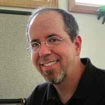 Especially considering these last
topics, I am glad and grateful I had a chance to participate in the traditional
visual effects era, even if it was only for a few years.
Especially considering these last
topics, I am glad and grateful I had a chance to participate in the traditional
visual effects era, even if it was only for a few years.
Q: I’d like to thank you for sharing your
thoughts, memories and anecdotes with us Mark.
It’s really been a pleasure and I'm most grateful.
A: Thank you too, Pete, and I’d also like to
thank my friends Randal Dutra, Rocco Gioffre and Ted Rae for their help with
the pictures.